Home
Our Chicago Condo: Before and After
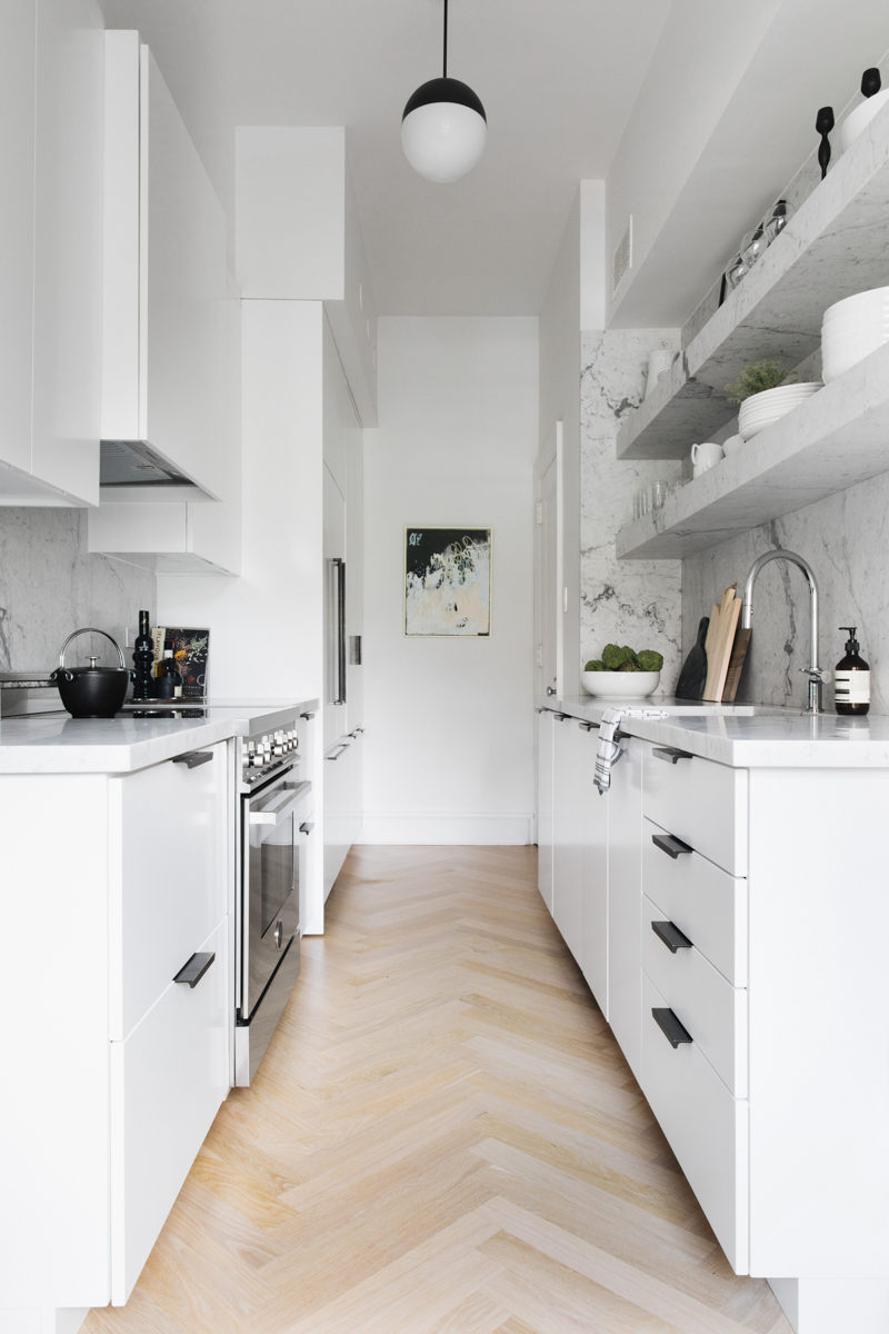
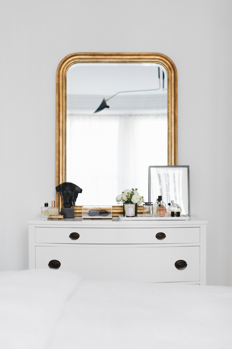
I recently shared a few before and after of our condo, located in the Gold Coast in downtown Chicago. We moved out almost a year ago and you loved (finally) seeing the before and after on instagram, I thought I’d share the whole thing here. Conor bought our condo in April 2016 and we moved in together the following October. He’s a realtor in Chicago and has a lot of experience and understanding with renovations, so he handled most of that and designed the kitchen and bath, but we collaborated on the finishes and and decorated the space together. Here’s a look at our Chicago condo: before and after.
Our Chicago Condo: Before and After
The flooring
We added herringbone floors in the kitchen and bedroom and stained all the floors 3 parts country white and 1 part weathered oak.
Lighting and paint
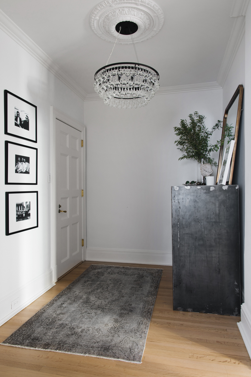
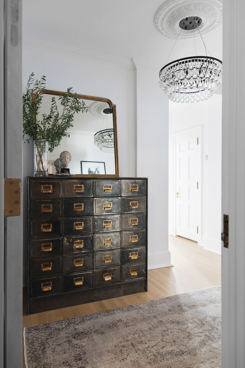
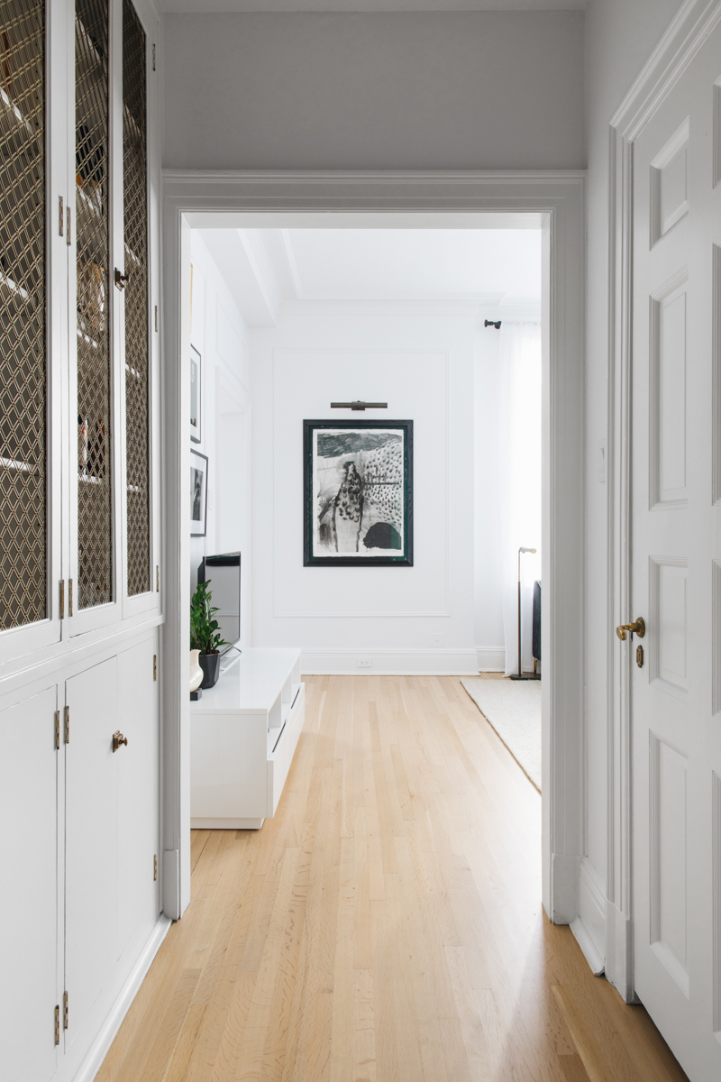
We changed out lighting, added ceiling medallions (from Decorator’s Supply), and redid the bathroom. The walls are all Farrow & Ball Wevet. I linked to most of our sources in this post.
As you can see from the below, a little paint and lighting goes a long way.
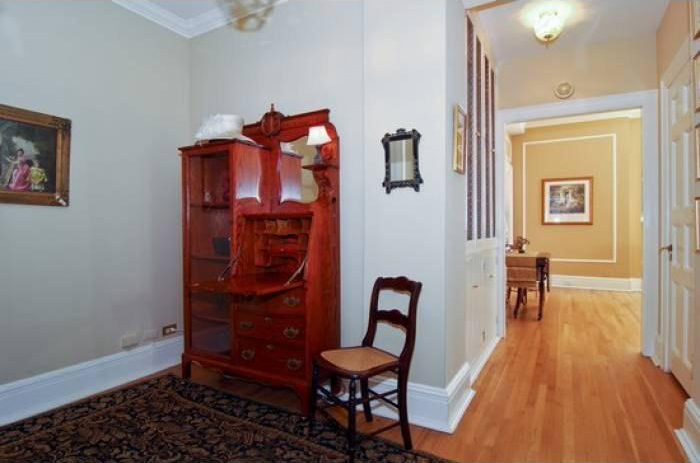
The Entry before and after
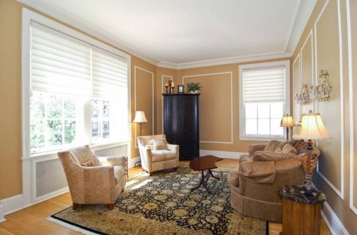
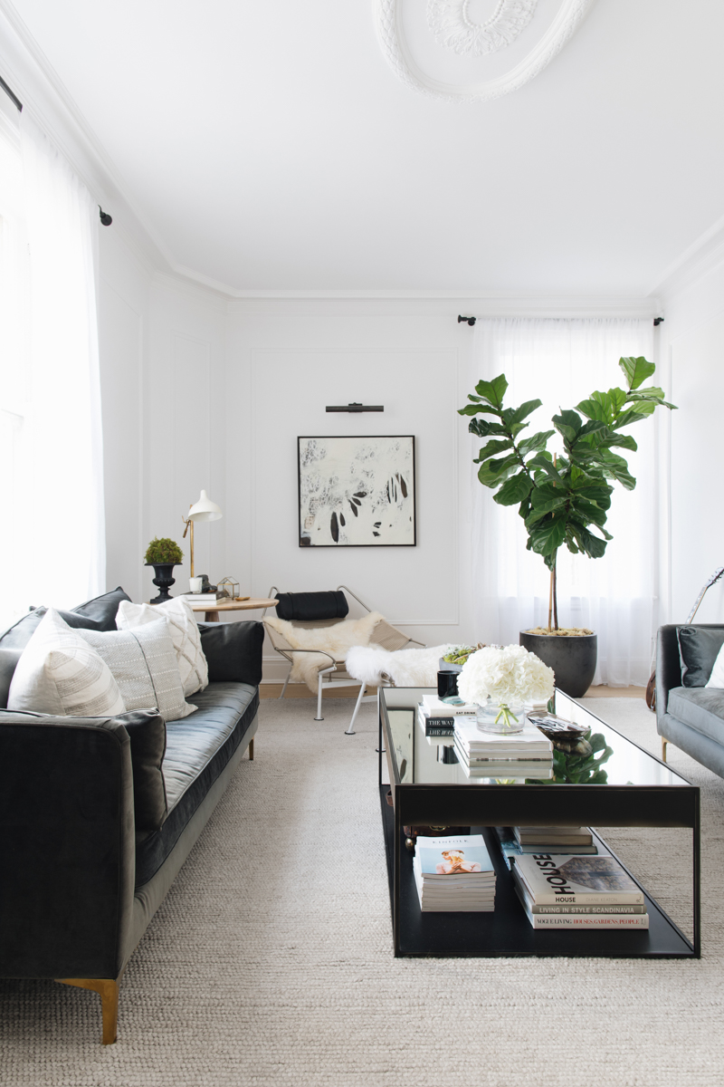
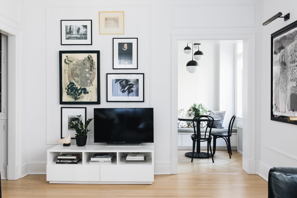
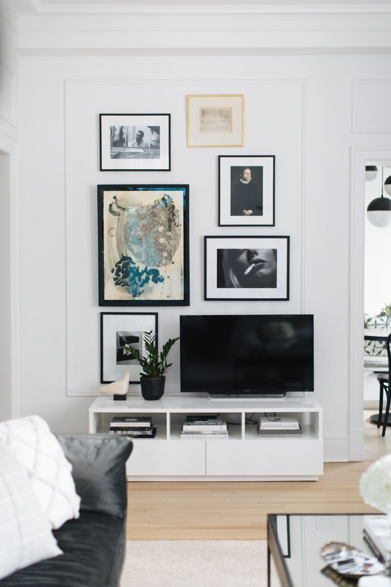
The living room before and after
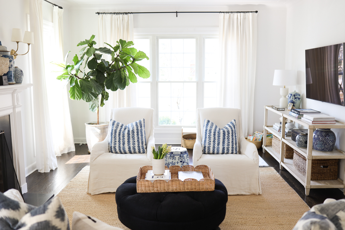
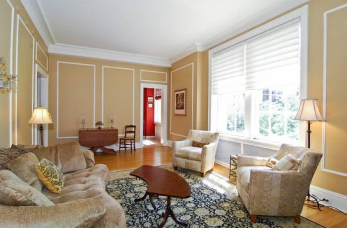
Here’s a look at the living room. We stained the floors, painted, and added a ceiling medallion. Opening up the entry to the kitchen brought more light into the space, and made it feel a little larger, too.
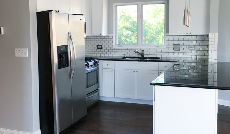
The kitchen before and after
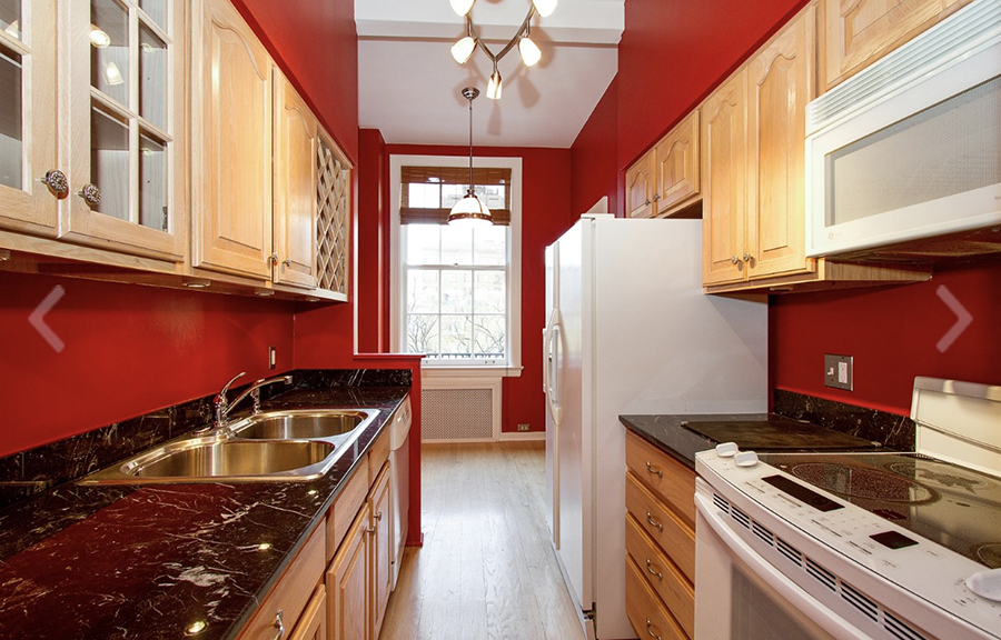
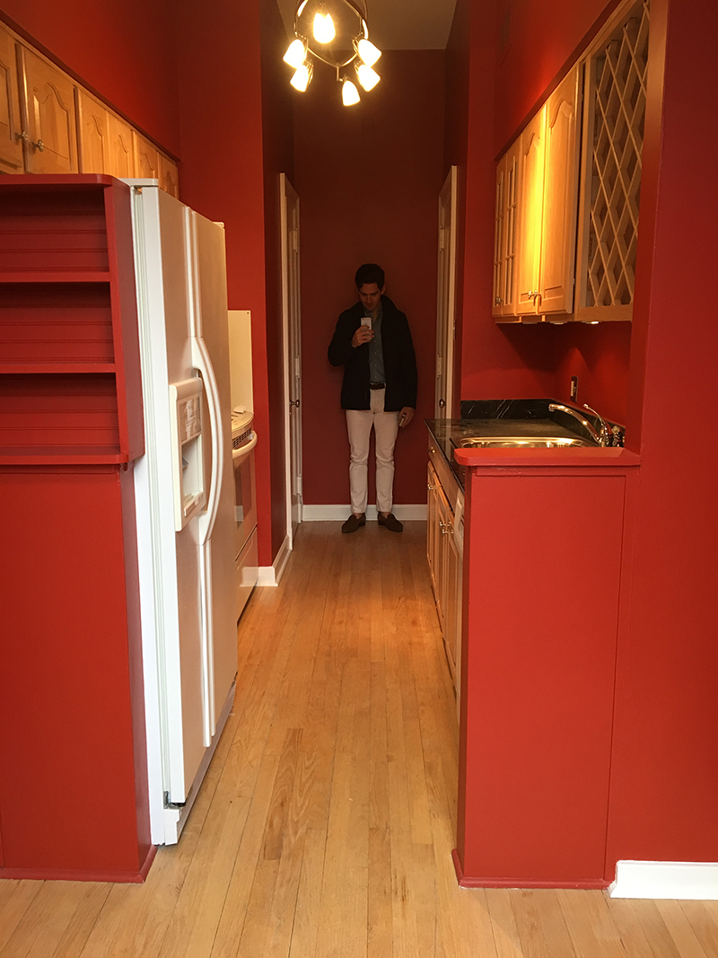
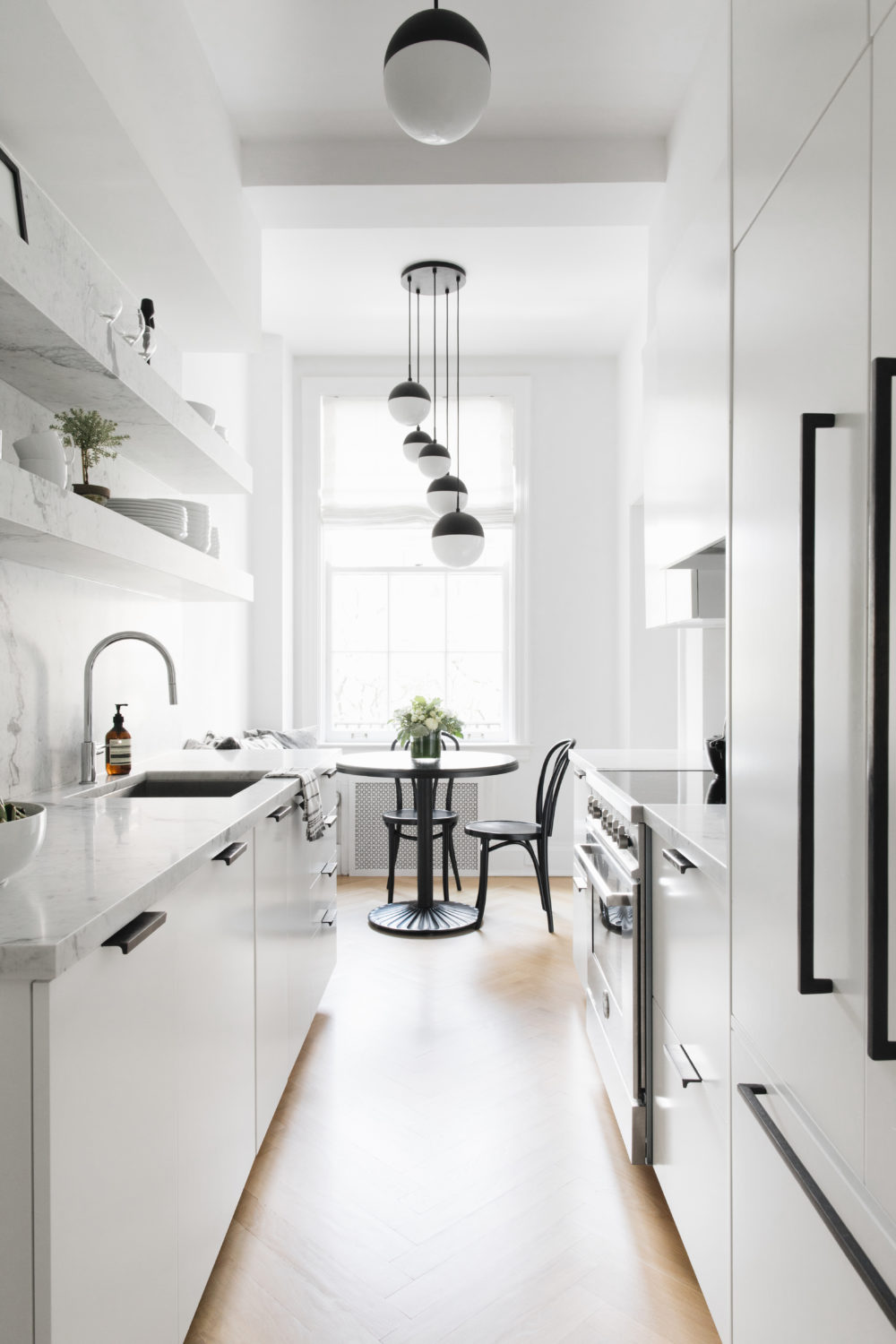
The biggest transformation took place in the kitchen. It’s a galley kitchen, so there’s not a ton of space, and the old layout and design felt a little too bold and very cramped. The red walls were…something.

Bedroom before and after
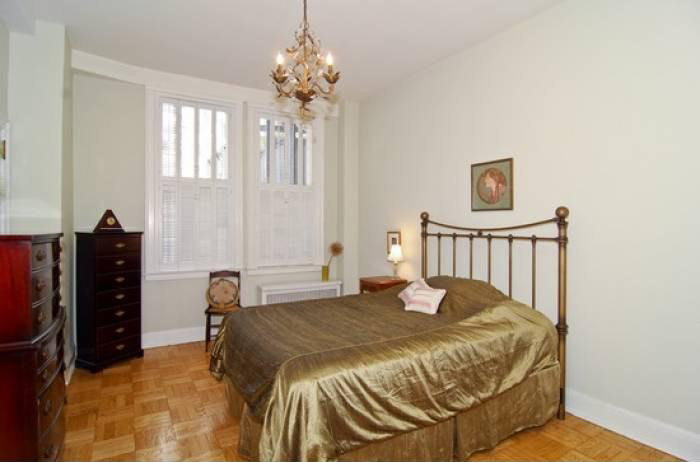
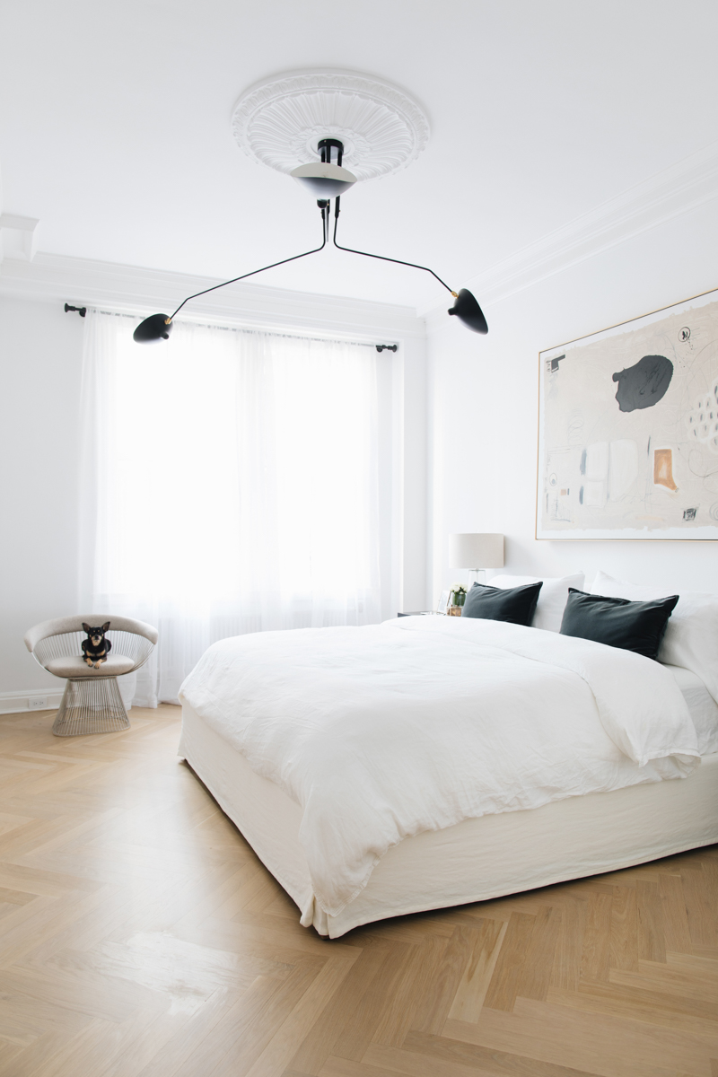
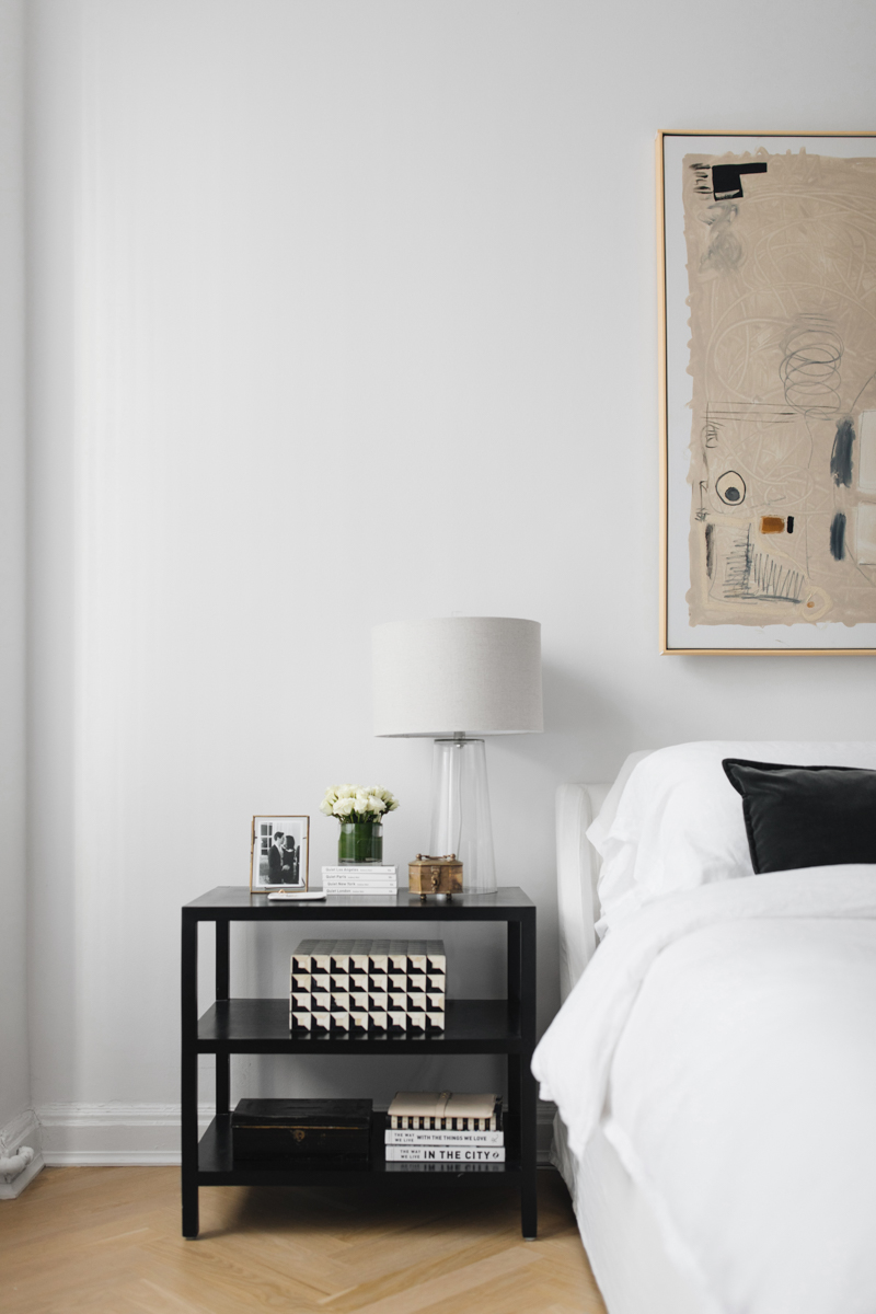
Removing the shutters and replacing the parquet with herringbone made the space feel larger and more open. The parquet also felt quite dated, so this gave the room a more modern, updated feel. We added a ceiling medallion, and some sheer curtains to keep things light and airy.
Bathroom before and after
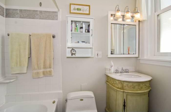
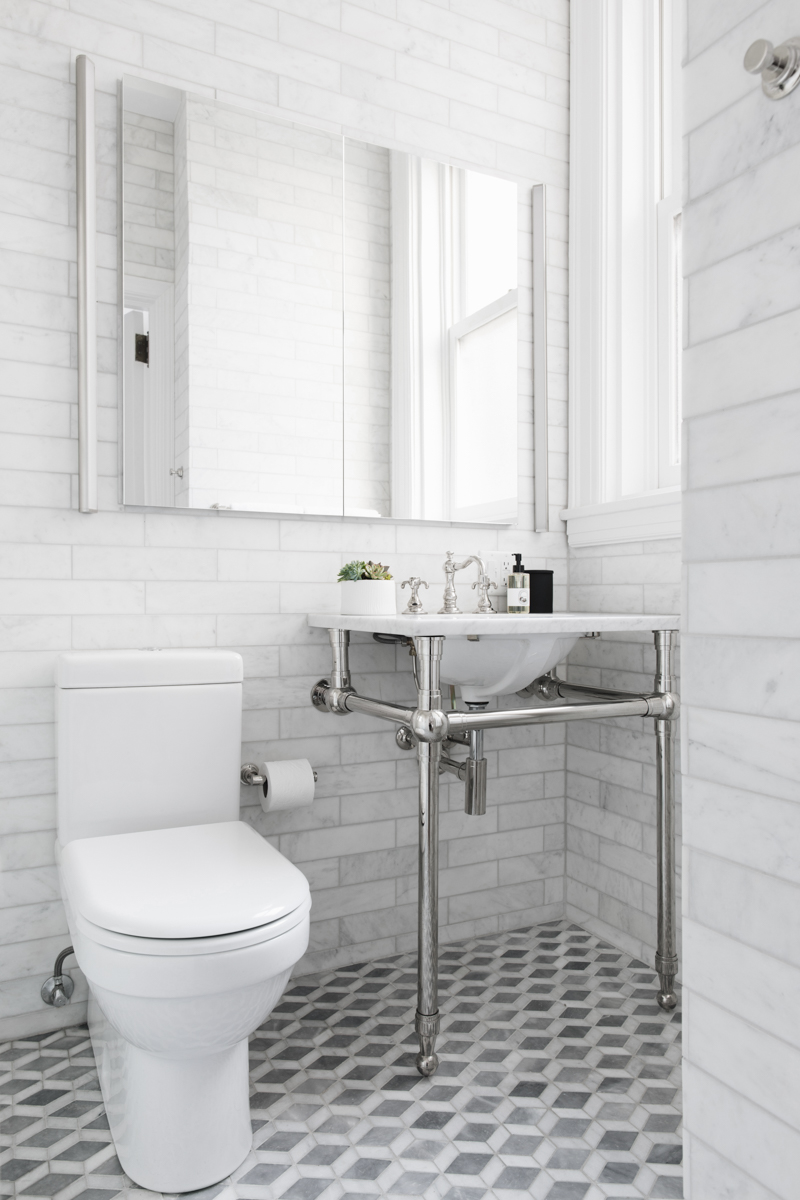
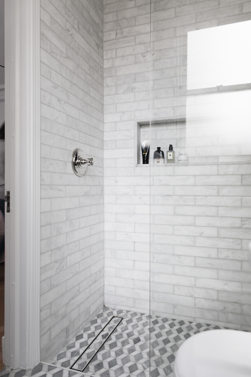
The bathroom is teeny tiny, and reworking the space a little, and choosing the right updates made it feel a lot bigger. The open vanity made the room feel larger, and the oversized mirror medicine cabinet gave us a ton of extra storage.
