Home
Family Room Ideas: Furniture and Decor Updates
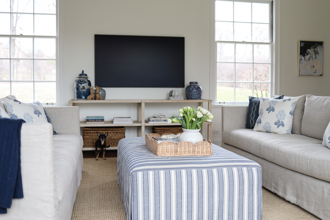
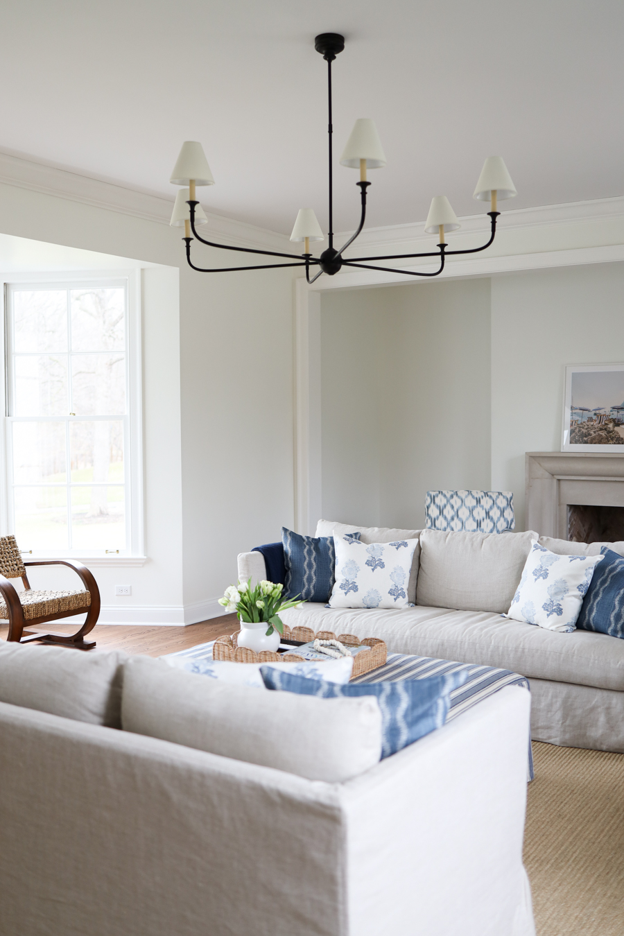
The transformation of this space has taken a lot longer than I thought it would, and it’s exactly what I hoped it would be for our family. This room really feels like the heart of the home – from the cozy seating to the lighting fixtures, this is the perfect family space. There’s plenty of sitting room, floor space for the kids to play, and a cozy little spot by the fireplace. And today, I’m excited to share some family room ideas for a kid and family friendly space, and some updates we plan to make to make it even cozier. So today, I’m going to share some favorite family room ideas, and how I
Family Room Ideas: Furniture and Decor Updates
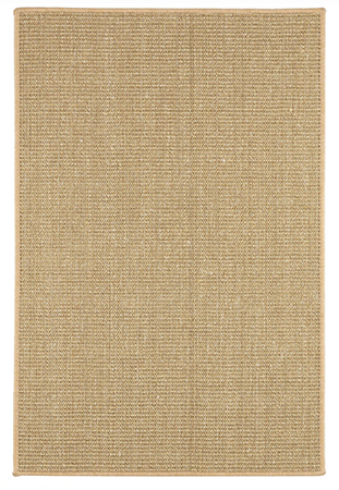
Our last family room also functioned as our living room space. It was the room we used most in our home. I learned a lot about how to use a small space and have it function with two little ones at home. Our current family room is right off our formal living space, which I suppose serves more as a modern living room since it doesn’t feel overly formal. It’s a room we haven’t used much since it was empty until not too long ago. It’s nice to fully focus on this being a family space, from toy storage to enough space for the kids to really play. The room is rather long, so instead of opting for two area rugs, we chose one long large rug from Annie Selke. The sisal is more affordable than wool and I love the clean, casual look.
The Design Process
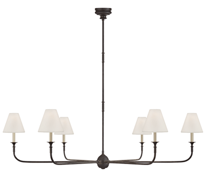
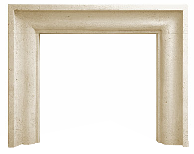
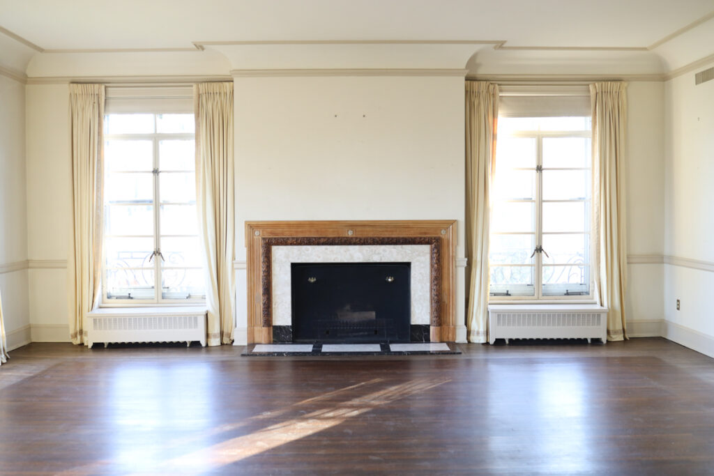
The first step was figuring out what bigger changes to make. You can see the before and some of the structural changes we made here. Removing all the cans and adding a chandelier with shades to the high ceiling added a lot of warmth and interest. It’s amazing how much light fixtures can change a space. Lowering the fireplace changed the entire room feel, and made a huge difference. It made the room feel more modern and updated. I would have loved to have kept the bookshelves but they had to go in order for us to lower the fireplace, so we’ll find a way to fill that space.
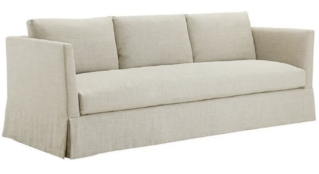
I did consult with my interior designer friend Kira David on a few things and with stylist Steve Cordony via The Expert – it is so nice to talk to someone who can help you look at things differently. Steve suggested the layout for this longer room – two sofas flanking a large, functional ottoman, and a TV to the side so it’s not a focal point. Placing the TV above the fireplace wouldn’t have made any sense in this room, and this layout allowed us to have a separate seating space by the fireplace. There’s even some room for extra toys behind the sofa.
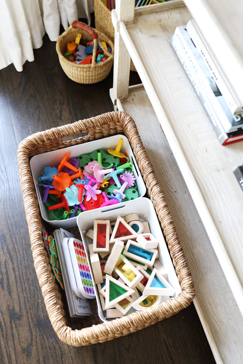
How to Store and Organize Toys
Choosing a palette
And like I always do, I chose a neutral and white palette for the larger pieces like the sofas and rug, so we can easily change out the color palette with throw pillows and other accessories. Snowfall white was the right paint color that feels bright but not too stark, and a neutral color allows you to bring in muted or bright colors, and to easily change them when you’re ready. And I love some pops of color (who knew?) as long as that color is blue or green.
What’s next
The room gets a ton of natural light, so some window coverage feels important, and I loved the idea of adding some more layers to the space. In the next 4-6 weeks, our Hunter Douglas woven shades from Beyond Shades will be installed. You can see the two styles we have in our home here. The large bay window feels like the perfect focal point, but looks a little empty right now. I’m excited to bring in some warmth and texture. I’d love some floor lamps and table lamps (warmth). An olive tree, some antique traditional pieces, and wall decor will change the room feel, but those things take time.
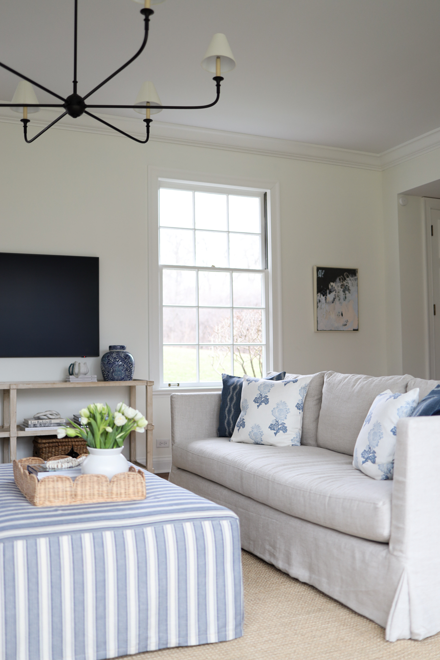
Creating the perfect space for your family
When designing a room, think about how you’ll use it. And when choosing furniture pieces, consider what works best for you. I knew I didn’t want a sectional because I prefer the look of two sofas. And when two young children and a baby, an ottoman was a must. Removing cans is always a good idea – I strongly prefer the softness of lamps. If you have young children and want the space to feel kid-friendly, it’s always a good idea to go with crypton (stain resistant) fabrics and making sure there’s space for their toys, and space for them to play.
Throw Pillows
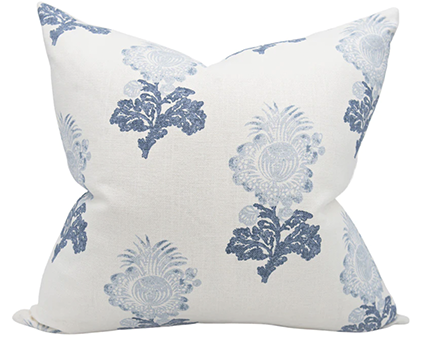
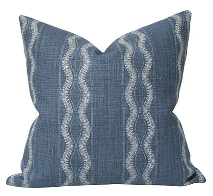
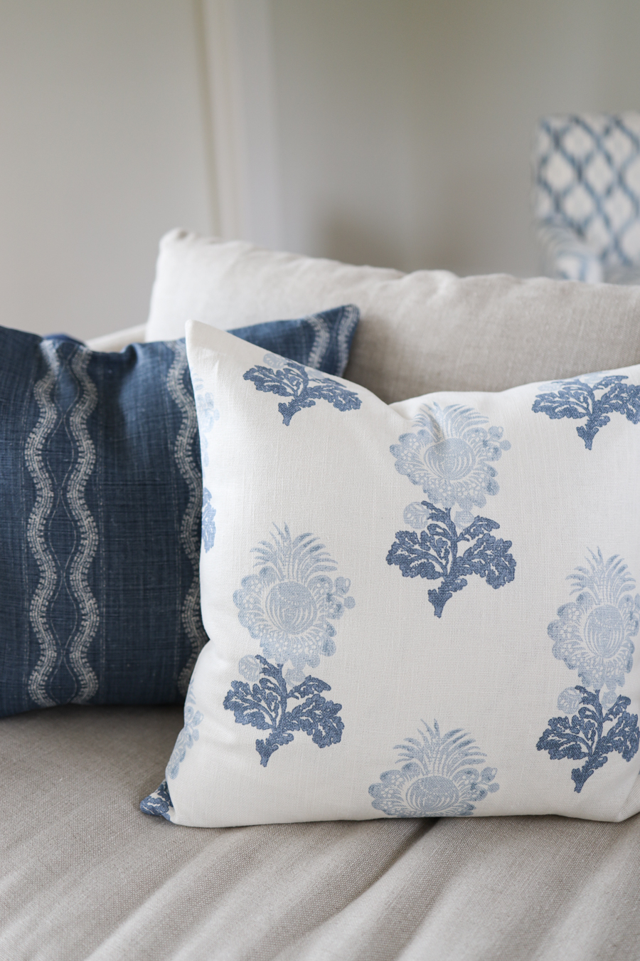
I partnered with Arianna Belle and chose these throw pillows to bring some pattern, color, and warmth to our main seating area. I just love this color scheme and how these prints work together. There’s plenty of space for the whole family, and throw pillows are an easy way to bring texture and comfort to your family room.
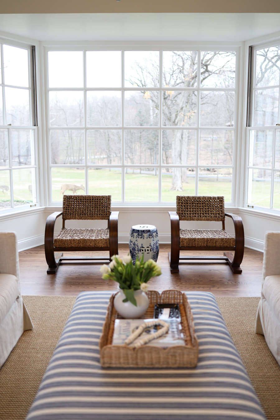
The Bay Window
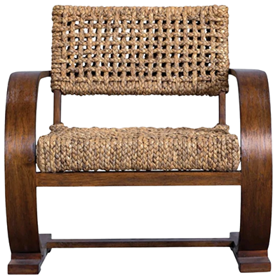
I just love this view. These chairs aren’t right for curling up and watching a movie, but they add more texture and interest – and we always get complements on them. When you have chairs that aren’t right around your coffee table or ottoman, consider adding small tables so guests have a place to put their drink.
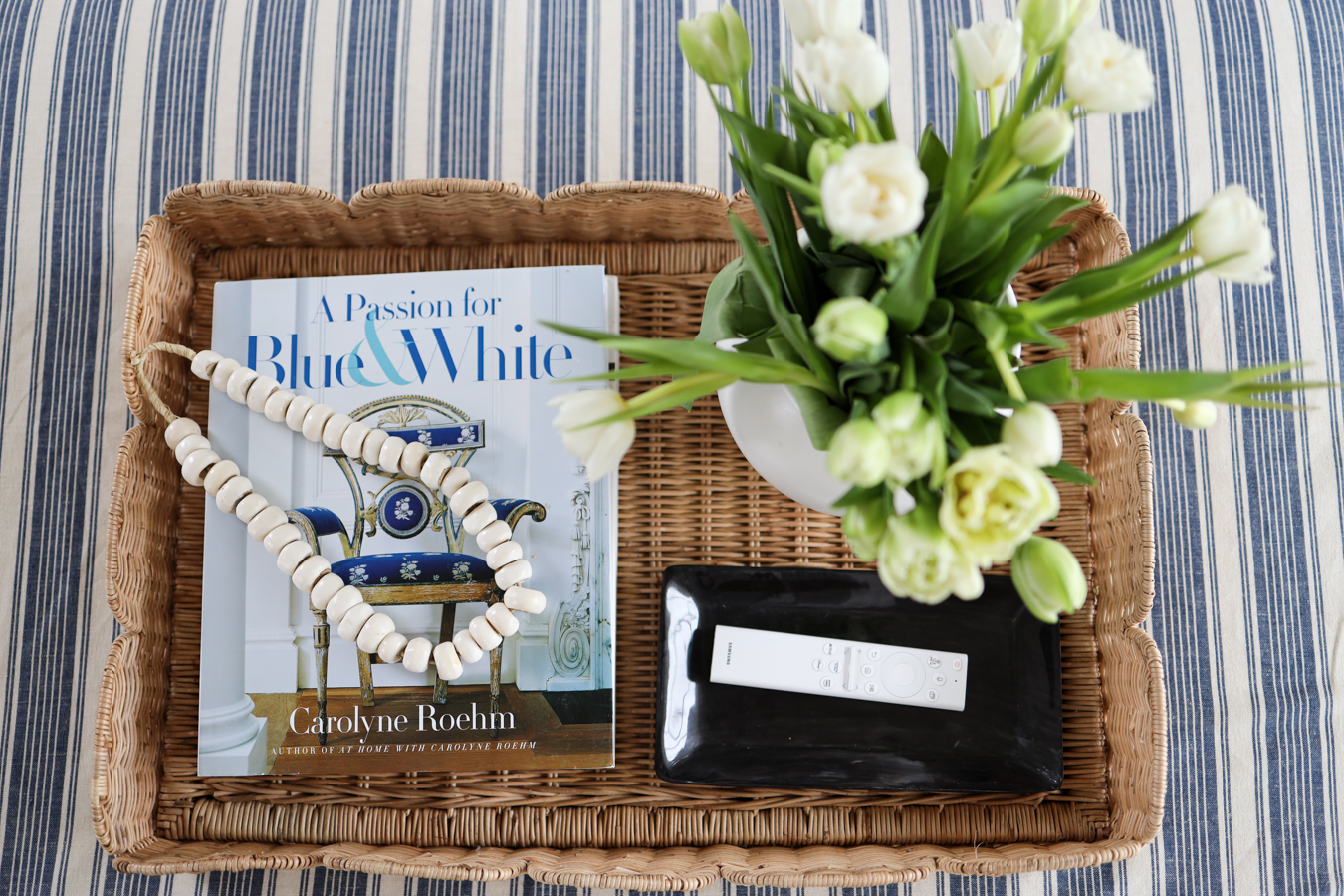
The Oversized Ottoman
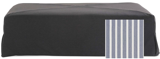
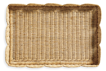
Instead of a coffee table (sharp corners!) I chose an oversized ottoman. With two young children and a baby, something safe and soft feels ideal, and it’s a cozy place to put your feet up. The (custom) slipcover is easy to clean, too, and we can easily have another one made down the line. I love that it’s the perfect spot for board games, too. The tray is the perfect spot for decorative objects and one of the easiest ways to add practical storage to an ottoman. There are some great options if you’re looking for something different from your standard coffee table.
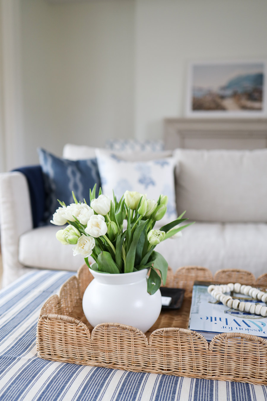
Coffee Table and Ottoman Decor
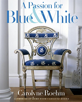
I recently wrote a post on coffee table decor, so if you’re looking for trays, vases, boxes, and other decor, this is the post for you.

The TV Area
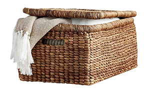
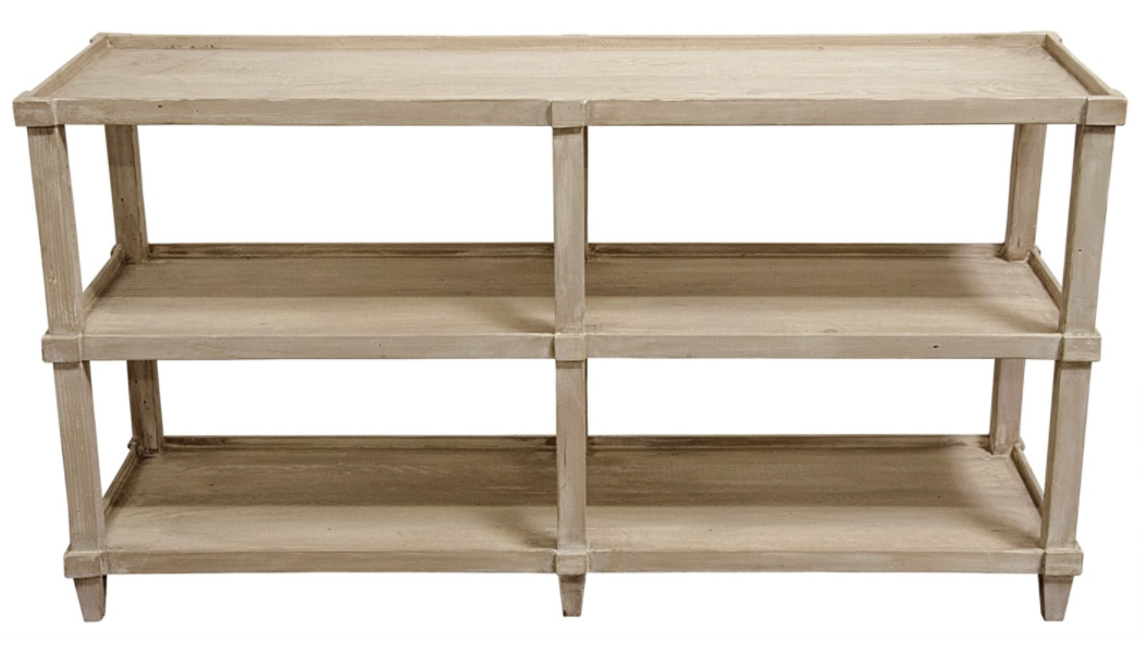
I don’t love when a TV is a focal point of a room, and an entertainment center didn’t feel right for us. So we used our console under the Frame TV again, and it’s the perfect piece to fill the space. It’s also the perfect place to hold baskets for toys and decorative items.
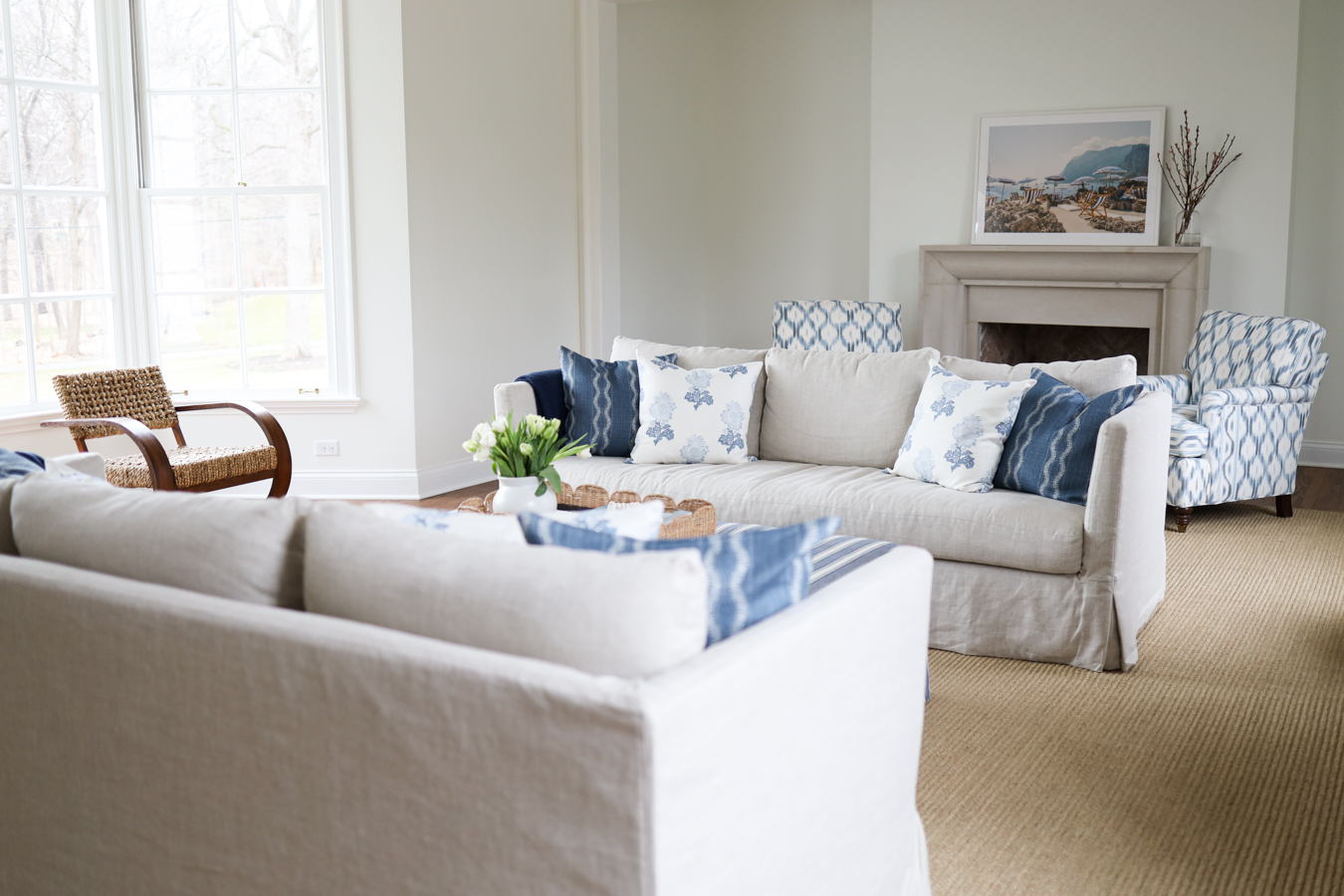
The Fireplace Area
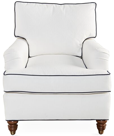
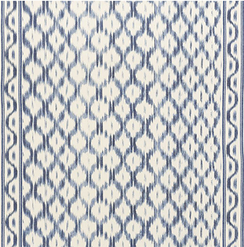
I ordered two club chairs that I planned on leaving white. The fabric that is currently on the chairs was initially meant to be used on drapes, but the cost was far too high. So I changed plans and bought 1/3 less of the fabric and had the chairs reupholstered.
If you’re looking for gallery wall ideas, read this post.
A cozy living room or family room will make you feel at home, and what feels like home is different for all of us. But reading posts like this, scouring pinterest, and following some of your favorite designers and stylists is a great place to start.
This post contains affiliate links. When you purchase something using my links, I may earn a small commission at no cost to you.

