My Home
Black and White Bathroom Decor Ideas
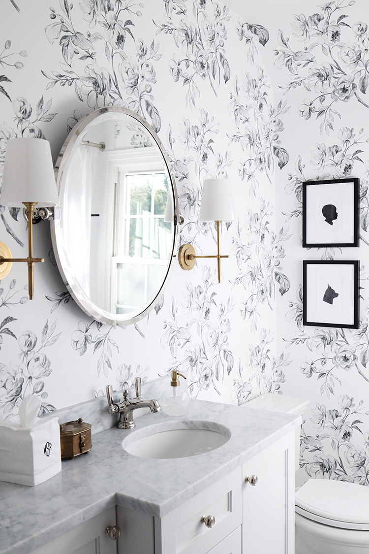
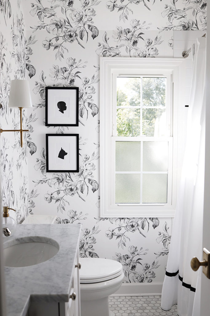
When we bought our house, there were some updates we wanted to make so it would feel more like our home. It mostly came down to paint, lighting, and window treatments – it’s amazing how some simple updates can make such a difference. The bathrooms were “done” but did not feel like us at all. They were technically “finished” but we love interiors and planned on staying in the house for a while.
Black and White Bathroom Design Ideas
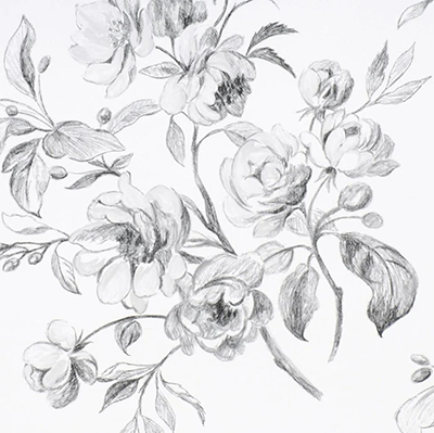
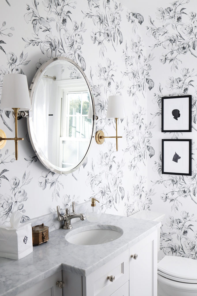
Having a home that reflects our style is something that was important to both of us, and I really wanted to make my daughter’s bathroom a beautiful space, but knew I didn’t want to redo everything. The subway tile with black accent tile was really nice and redoing it would have added unnecessary costs, so I decided to use that as starting point for the design. Then I saw this black and white floral bathroom wallpaper which served as my inspiration for this small bathroom remodel.
I love the classic black and white color palette. If you’re going for a black and white look for your bathroom, this is the post for you. I’m going to share some great ideas for a functional space for kids, and how we made a modern bathroom design a bit more traditional without completely renovating the space. Adding wallpaper, a new mirror, white and black accents, and other accessories is the perfect way to make a space your own. Here are some black and white bathroom ideas.
Bathroom Wallpaper Ideas
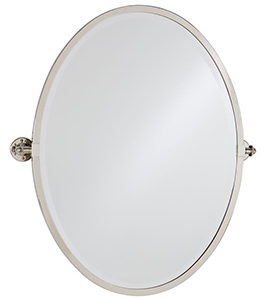
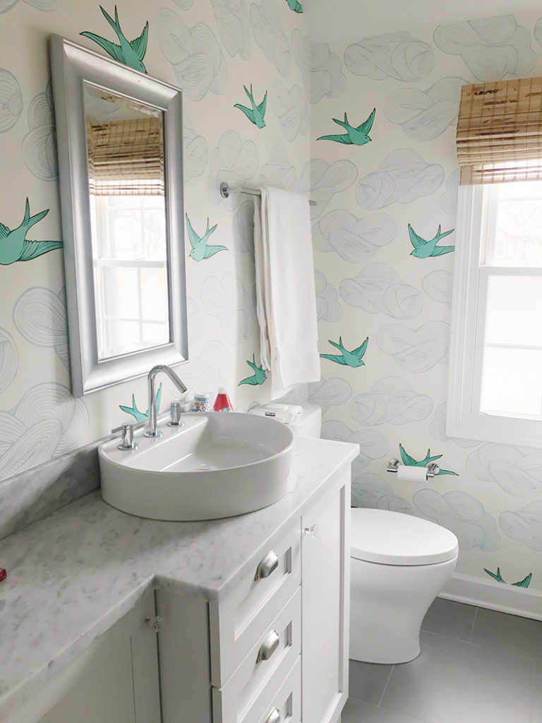
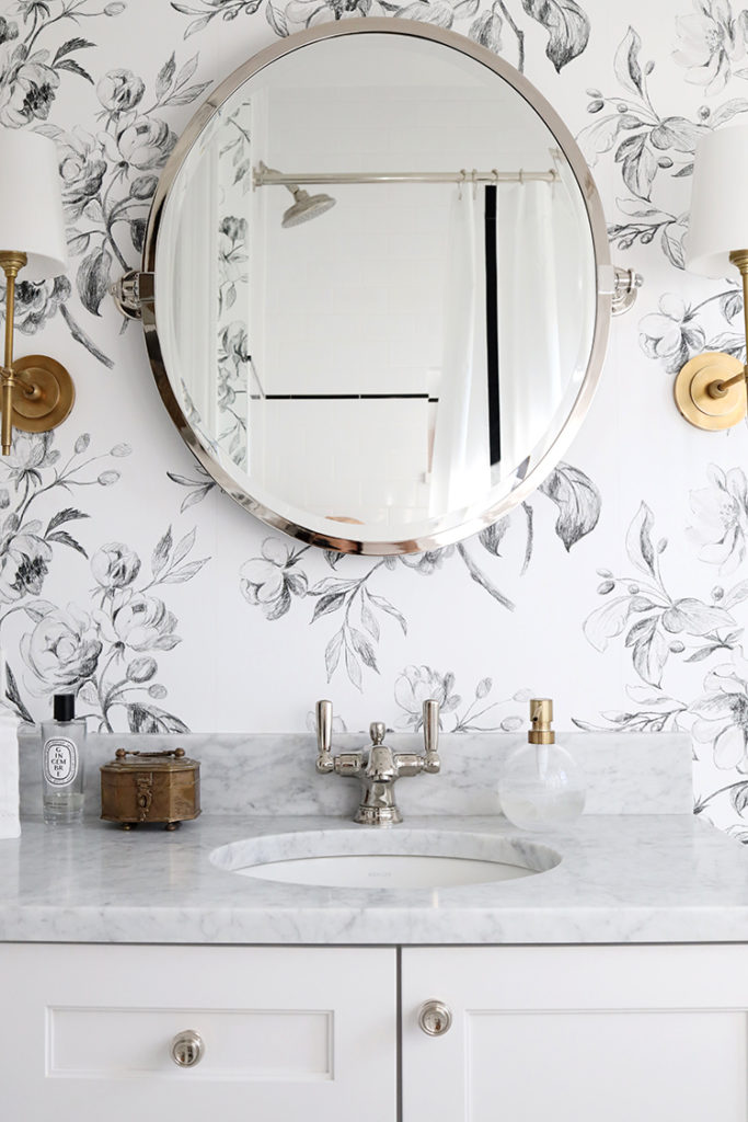
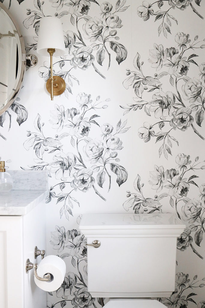
This bathroom was my project. Conor didn’t really have an interest in our daughter’s bathroom and I was so excited to take it on. It’s a small space and needed more than white walls. I looked for a wallpaper that was fun and feminine but not too over the top. The floors, mirror, and vessel sink were replaced, too. The old sink belonged in a very modern bathroom, so we switched it out with something more traditional. Had this been a powder room, we could have done something a bit more bold and dramatic, like black floor, but white marble made sense for a kids bathroom.
The wallpaper was not the look I was going for, the floor tiles felt kind of modern/industrial (the same tile was in our basement, and I covered that up, too). I don’t care for vessel sinks and the height made no sense for a toddler (too high), and the mirror was cracked/peeling. The modern toilets weren’t what we would have chosen, and I was so lucky to partner with Kohler, so we changed those for something more traditional and donated the old ones. A mix of polished nickel and brass fixtures added some warmth and interest to the room. They really are the perfect combination.
The Design
I really embraced the simple black and white color scheme – classic black and white is a popular choice for bathroom. The white and black tiles in the shower, custom vanity, and countertops were lovely so we kept those. I usually prefer white or light grey grout, but black grout can really pop, too – it’s just a bit more modern. It’s a classic color combination inspired by the shower wall tiles – white subway tile with a thin timeless black border. So I started looking for black and white wallpaper to go with the black and white palette.
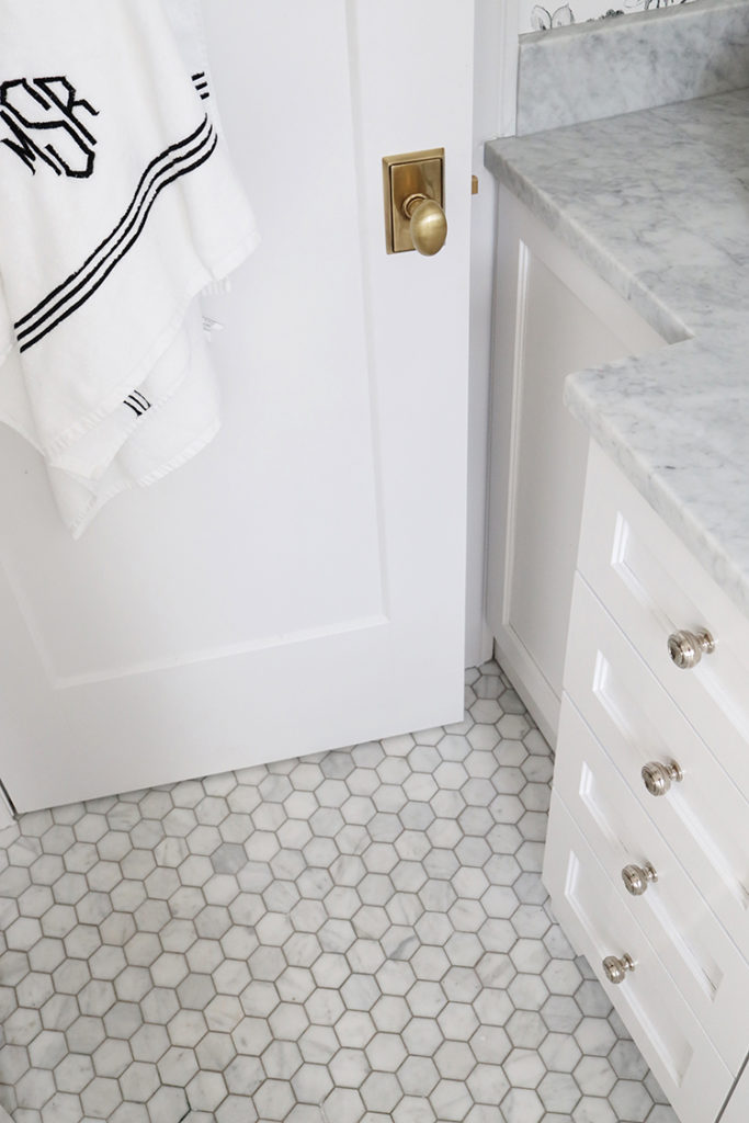
I chose a bold pattern that’s still soft for a beautiful, classic look with timeless appeal. We added carrara marble hexagon tiles which was a great choice (a classic!), and brass light fixtures worked perfectly with the polished nickel faucet. When designing a bathroom with a black and white scheme, don’t be afraid of different patterns. Florals and stripes, or even a block print mixed in adds some dimension to the space. I recommend wallpapering the entire room vs doing an accent wall.
I eventually added a simple white linen shade that offered privacy but let in plenty of natural light, and made the small space feel a bit more finished.
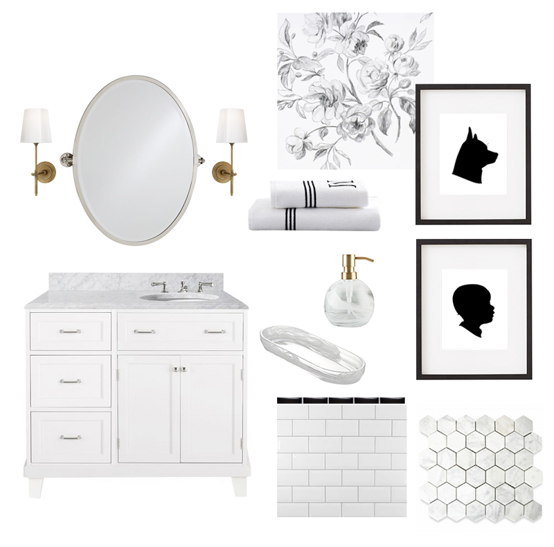
In the search for floral wallpaper, I fell in love with this black and white floral pattern, but it was impossible to find. Tessa at Inside Stores was so great to work with – this paper is just over $100 per roll and I only needed 3 rolls. This monochromatic look is clean and fresh but didn’t feel too modern at all. I couldn’t be happier with how it turned out.
Bathroom Lighting Fixtures
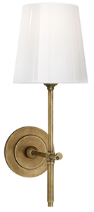
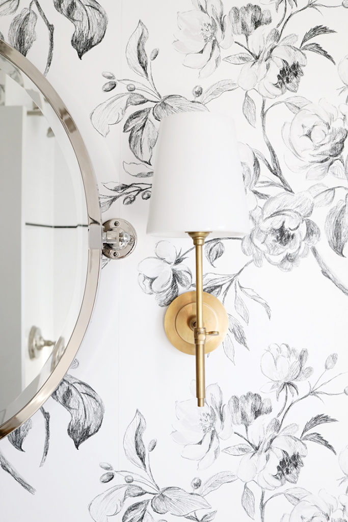
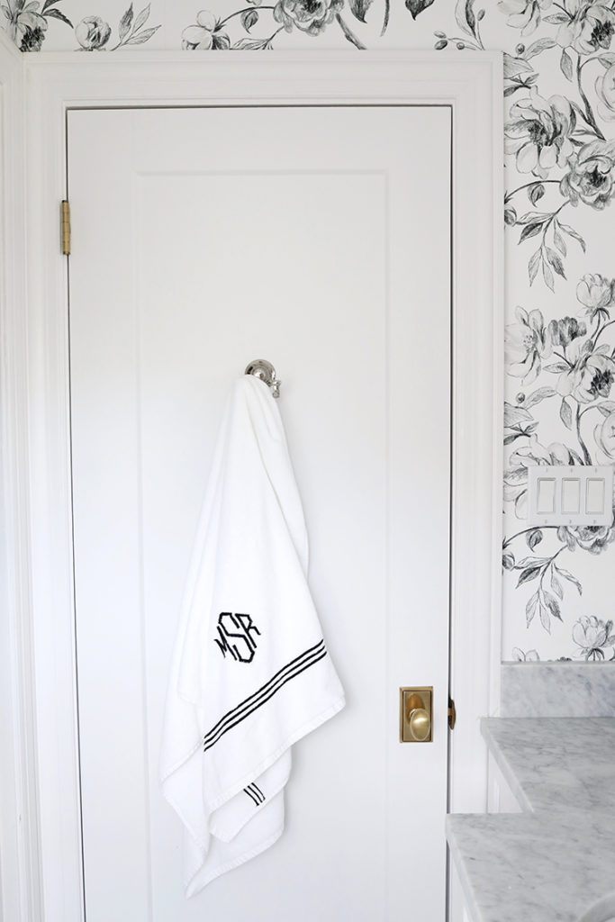
I decided to add sconces because I couldn’t find a light I liked enough to install over the mirror and prefer the look and feel of a sconce. Adding them meant losing the towel bar, so I added a towel hook on the back of the door, and still might add a ring or basket for hand towels. Since we have a half bath downstairs, guests don’t really use this bathroom, so I’m not too worried about towels.
Mixing metals
I’ve gotten a few questions about mixing metals, and I suppose there is a right and wrong way to do it, but ultimately, you have to do what you love. We mixed brass and polished nickel in both bathrooms. All the fixtures and mirror are polished nickel, I added a touch of brass with the sconces. This is a matter of personal preference, but I don’t care for gold (shiny, yellow gold) fixtures. I do love brass though. These Circa Lighting sconces are perfect for a bathroom since the shades are glass, so there’s no risk of damaging them, and they’re so beautiful in person.
We could have gone with brass hardware since it’s pretty much always brass or polished nickel, for me. But we did have some brass accents – our doorknob, sconces, and soap dispenser.
Paint
I painted the vanity Farrow and Ball “Wevet” and changed the hardware.
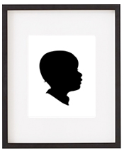
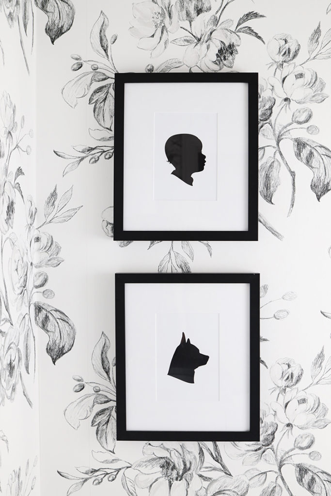
Once the room was complete, it felt like something was missing. I’ve always loved Le Papier Studio, and silhouettes of Margot and Buddy felt like the answer. They’re so, so sweet, and I couldn’t be happier with how they turned out.
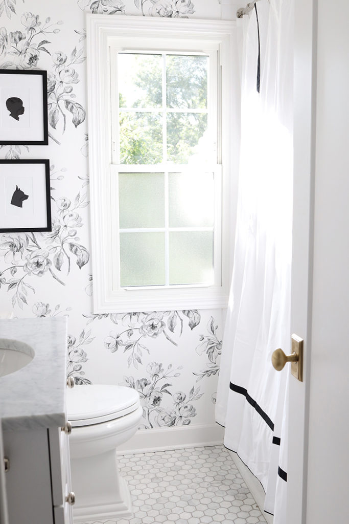
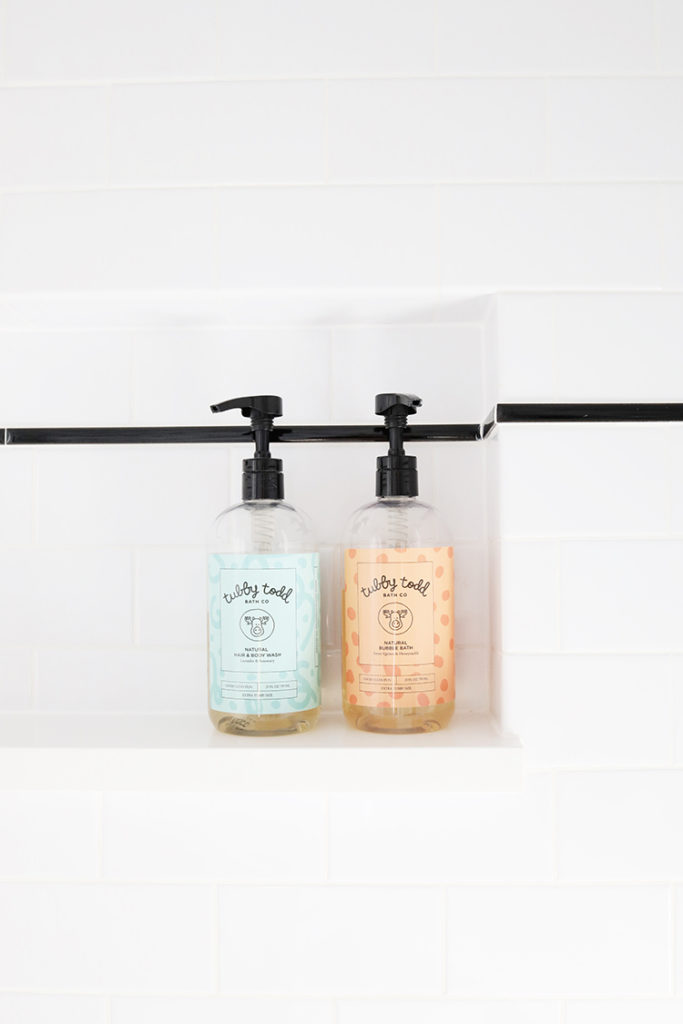
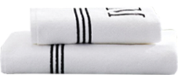
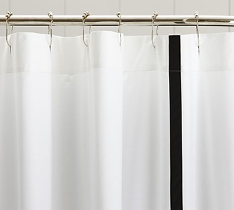
The towels, tissue box cover, and shower curtain were the final finishing touches, and arrived a few weeks ago. If you don’t have shower doors, a shower curtain is always a nice way to tie in the design. The towel monograms were probably a little over the top I love them. The accent color really pops and ties in with the black and white theme. And yes, we love our Tubby Todd products.
In a perfect world, I’d have space for a freestanding tub, but that wouldn’t have fit in a smaller space. Maybe in the primary bathroom in my next home.
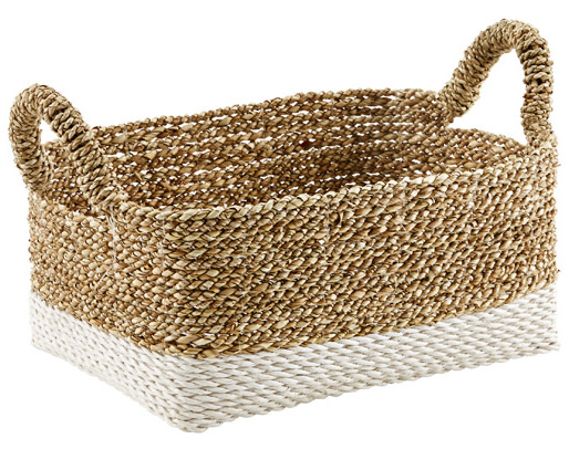
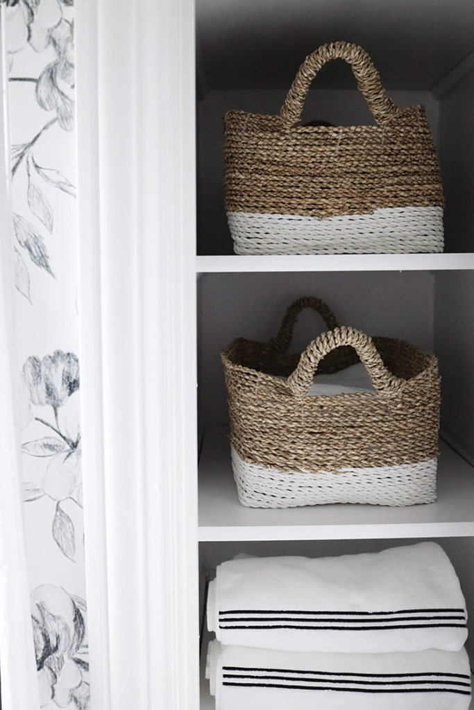
There’s an open “closet/shelf” across from the vanity, so I added these baskets and keep extra towels and bath toys in there.
Watelet Wallpaper
Bryant Sconce
Mirror
Silhouette Art
Bancroft Toilet Paper Holder
Marble Hex tile Flooring
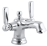
Bancroft Faucet
Kohler Compass Sink
Memoirs Stately Toilet
Glenbury Toilet Seat
Shower Curtain
Beach House Baskets
I’ve received a few questions about our contractor and wallpaper installer. Finding a good contractor is difficult. We ended up hiring someone else to fix a few things that were left unfinished, and the process took a lot longer than it should have. That seems to be the nature of that business and I am so happy with how it turned out, but I wouldn’t recommend the people we hired. The wallpaper installer was ok but not great. Our handyman (he did some repairs and has done work for us) is wonderful but so, so busy and not looking for any new projects right now. I would recommend searching for someone in your area online.
Kohler products, wallpaper, and silhouettes were gifted. I love and recommend all of them.
This post contains affiliate links. If you purchase something using my links, I may earn a small commission at no cost to you.

