Home
My Lakeview Apartment Tour: Before and After


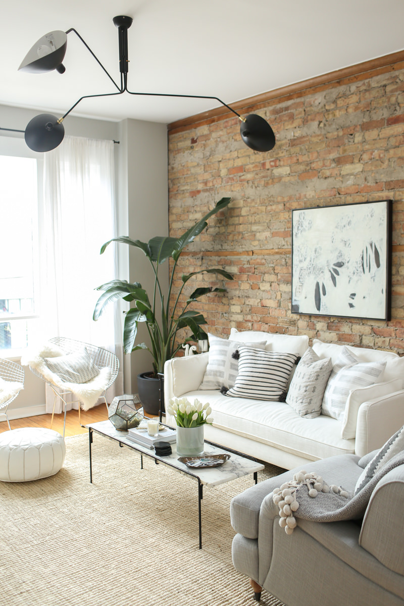
I moved into this apartment a few months after Conor and I started dating, so in 2015. Feels like another lifetime ago. This post was first published years ago, but I made some updates and wanted to share more about this Scandinavian style loft located in the Southport corridor of Lakeview in Chicago. The exposed brick, beams, and white painted floors were too good to pass up – it was an amazing space and so fun to live in.
The owner ended up buying all my furniture when I moved out (and into our Gold Coast condo) – so clearly, I did something right.
My Lakeview Apartment Tour: Before and After
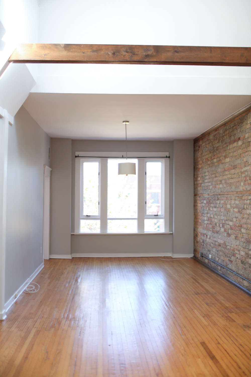
My home on moving day
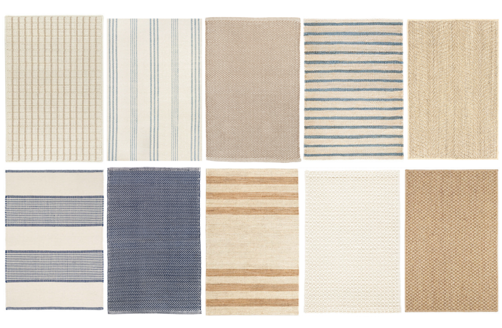
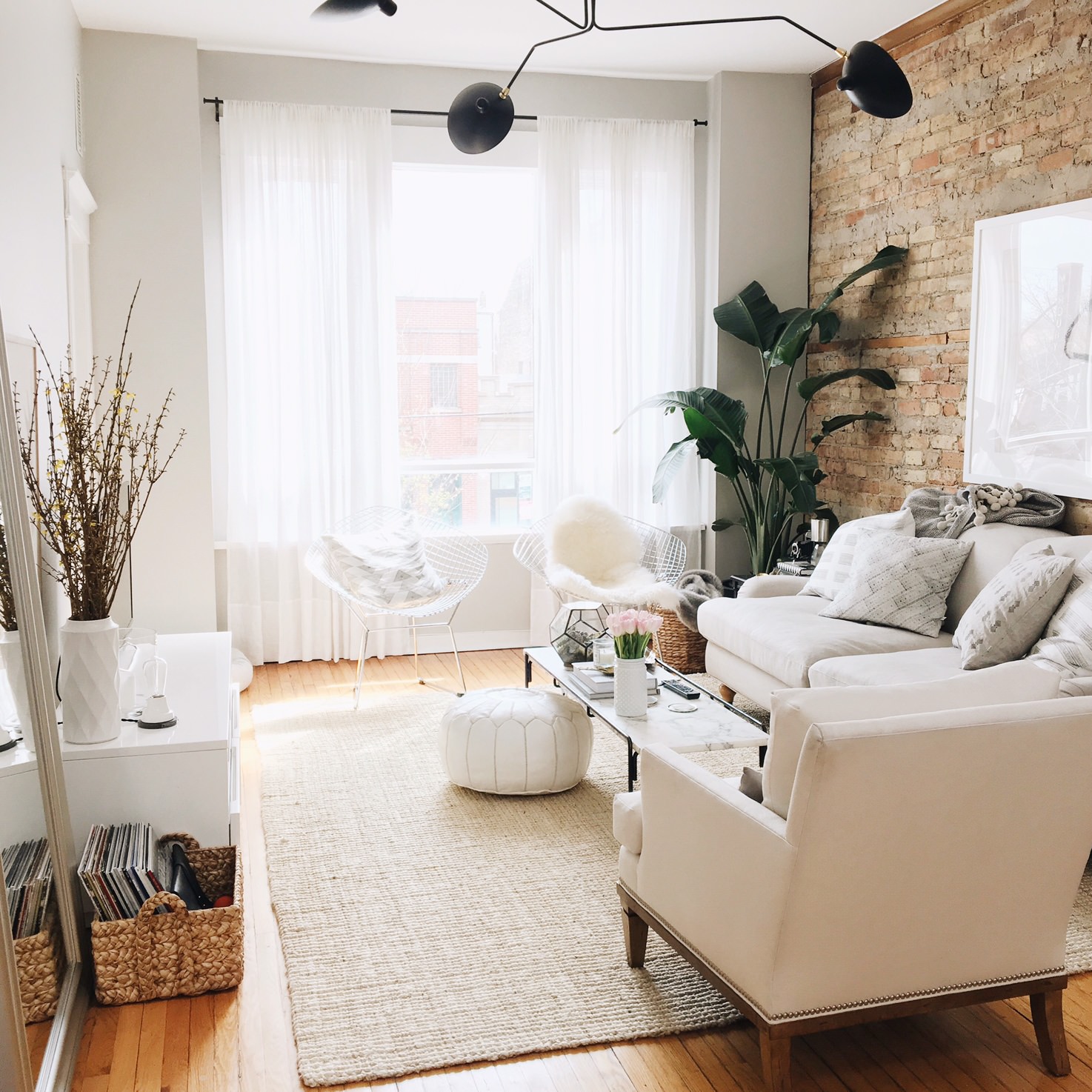
This very grainy iPhone photo was taken the night I moved in. As someone who moves fairly frequently, I’ve gotten pretty good at unpacking and usually empty all my boxes within 23 hours. I realize how insane that sounds, but even if everything isn’t put away, it’s best to get those boxes out of my home ASAP. I’ve been using redi-box for years and schedule my pickup a day or two after the move. Here’s a less grainy version taken the next day. So let’s talk about round 1 of decorating. This layout works except for the rug which is way too small. I recommend the jute boucle rug – it’s budget-friendly and comes in a variety of colors.
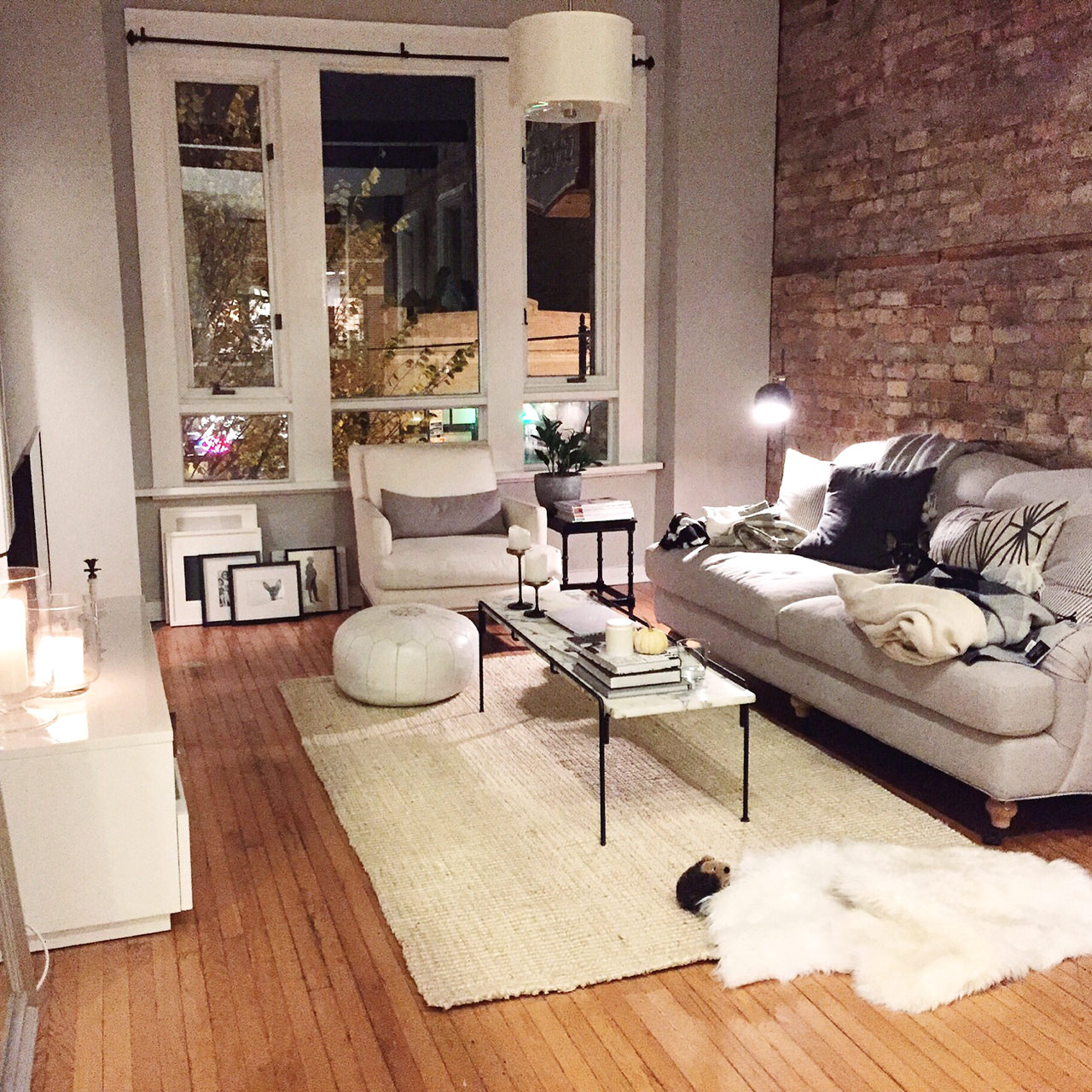
Styling tip:
Measure the room before going with a certain size because you’re “pretty sure it will fit.” See below.
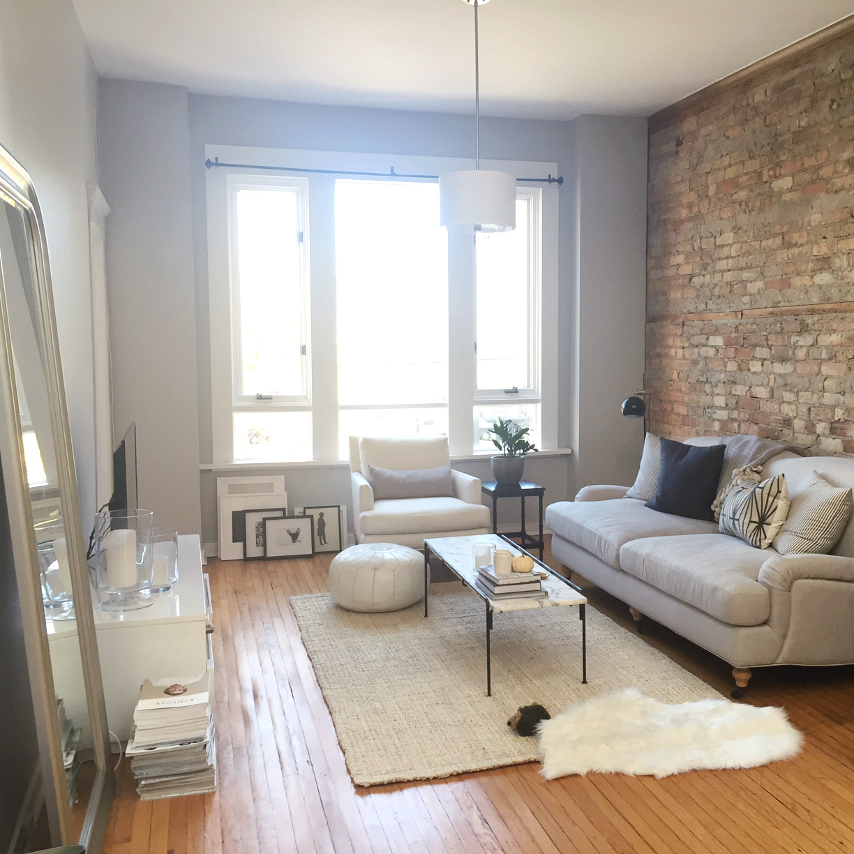
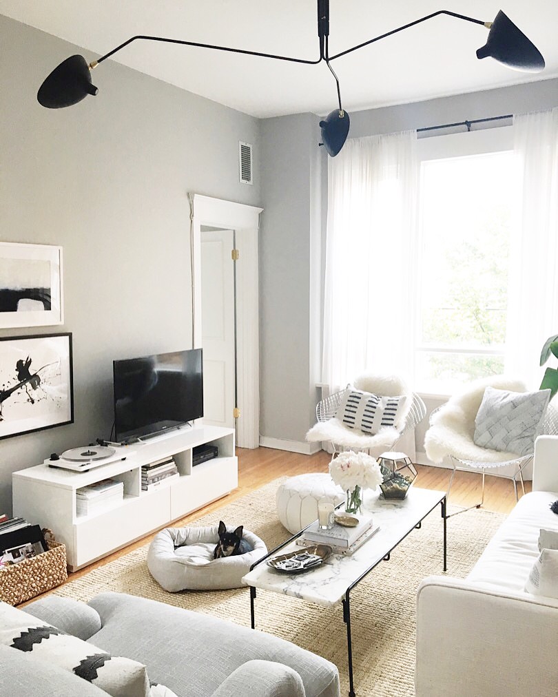
The room is fairly large and needed a larger lighting fixture, so I hired someone from Taskrabbit to do a little handy-work for me. My place is a rental, but changing out a light was worth $35. He installed my new lighting fixture, curtain hardware, and patched a few holes. I also have a thing for lamp shades. They feel really warm and inviting, so I always include a fabric shade. I love the ceiling fixture I purchased but rarely turn it on because I prefer the softer light of a lamp. So I picked up this floor lamp from West Elm and moved my schoolhouse task lamp into my office.
Styling tip:
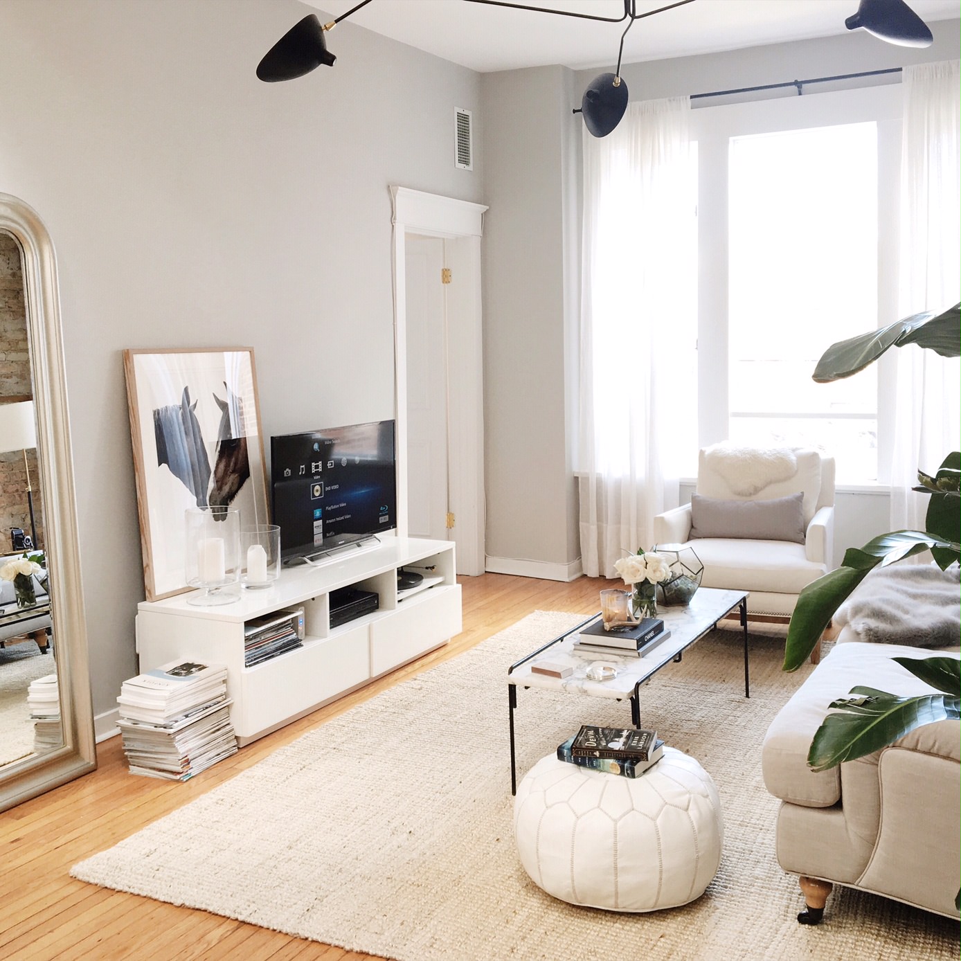
Never hang curtain rods on window molding. What you see above was not done by me, but don’t worry – I fixed it. I would have had the rod a bit higher but didn’t want to have to alter my curtains for a rental and made these Pottery Barn curtains work. Also switched the 5×7 rug for an 8×10. So much better, right?
Styling tip
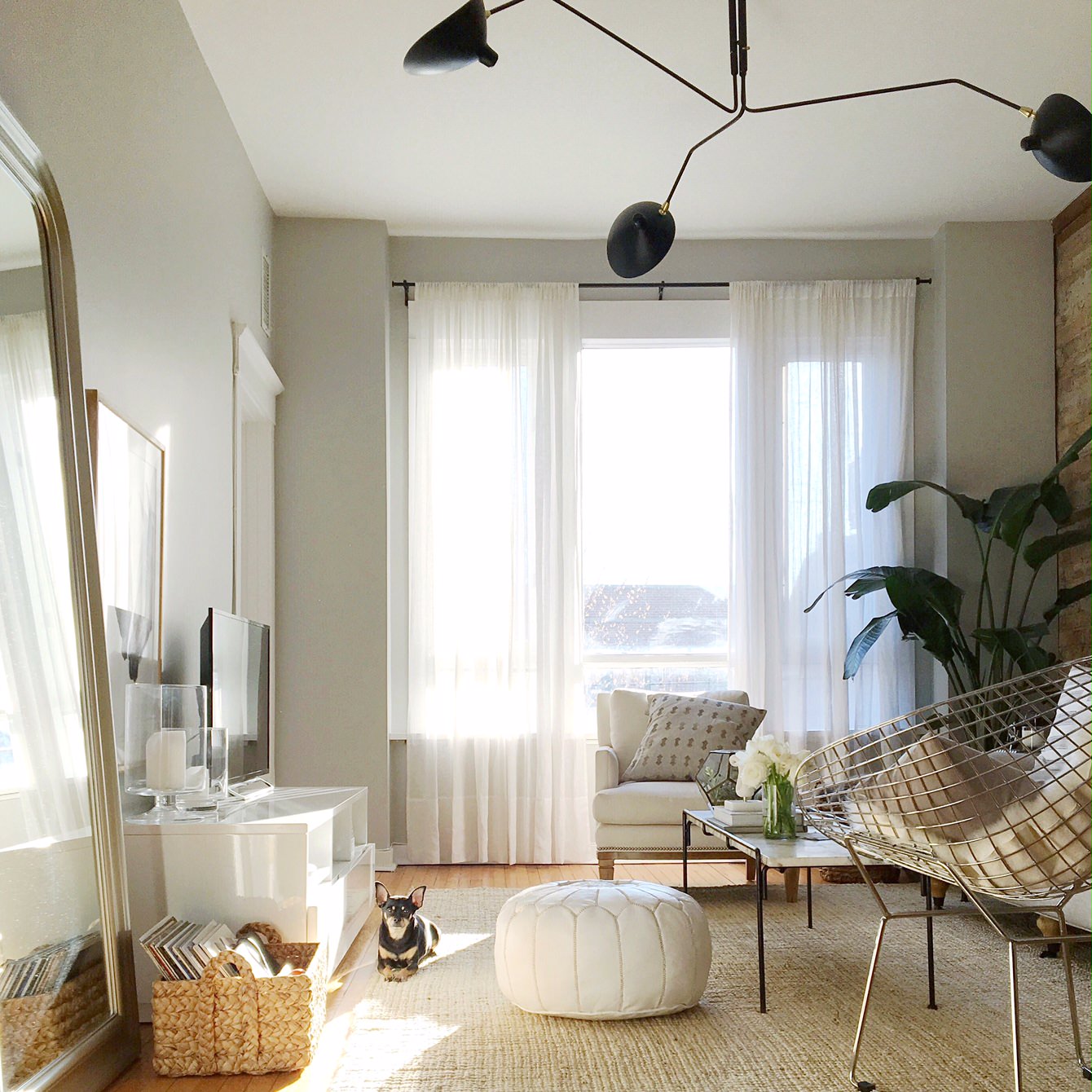
Leave harsh, overhead lighting off, change out “boob lights” for something that looks better (and can be turned on without being offensive) and add a few lamps for warmth
Move things around
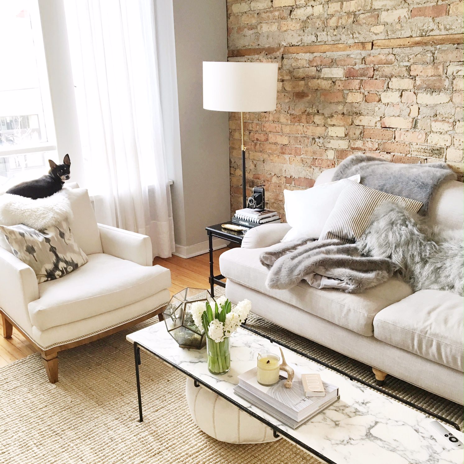
As soon as my new Lulu & Georgia chairs showed up, I moved my armchair to the other side of the room and put the palm plant in the corner to fill that space. I thought about having the two chairs on the other side, but since they took up more space, it made more sense (to me) to have them in a lower-traffic area. I liked looking at the front of the chair vs. the back when I walked in and added some of my favorite Susan Connor pillows which gave the room a bit of pattern and texture. The room is fairly large and connects with my dining room, and never really felt complete until my new chairs came in and I had a chair dividing the two rooms.
Plants also bring a lot to the table
I know nothing about plant maintenance which is why I’m on fig tree #3 (in my office). So do some research and ask your florist what’s best for the type of light in your room. I will say that succulents and zz plants always do best with me because they’re really tough and virtually un-killable.
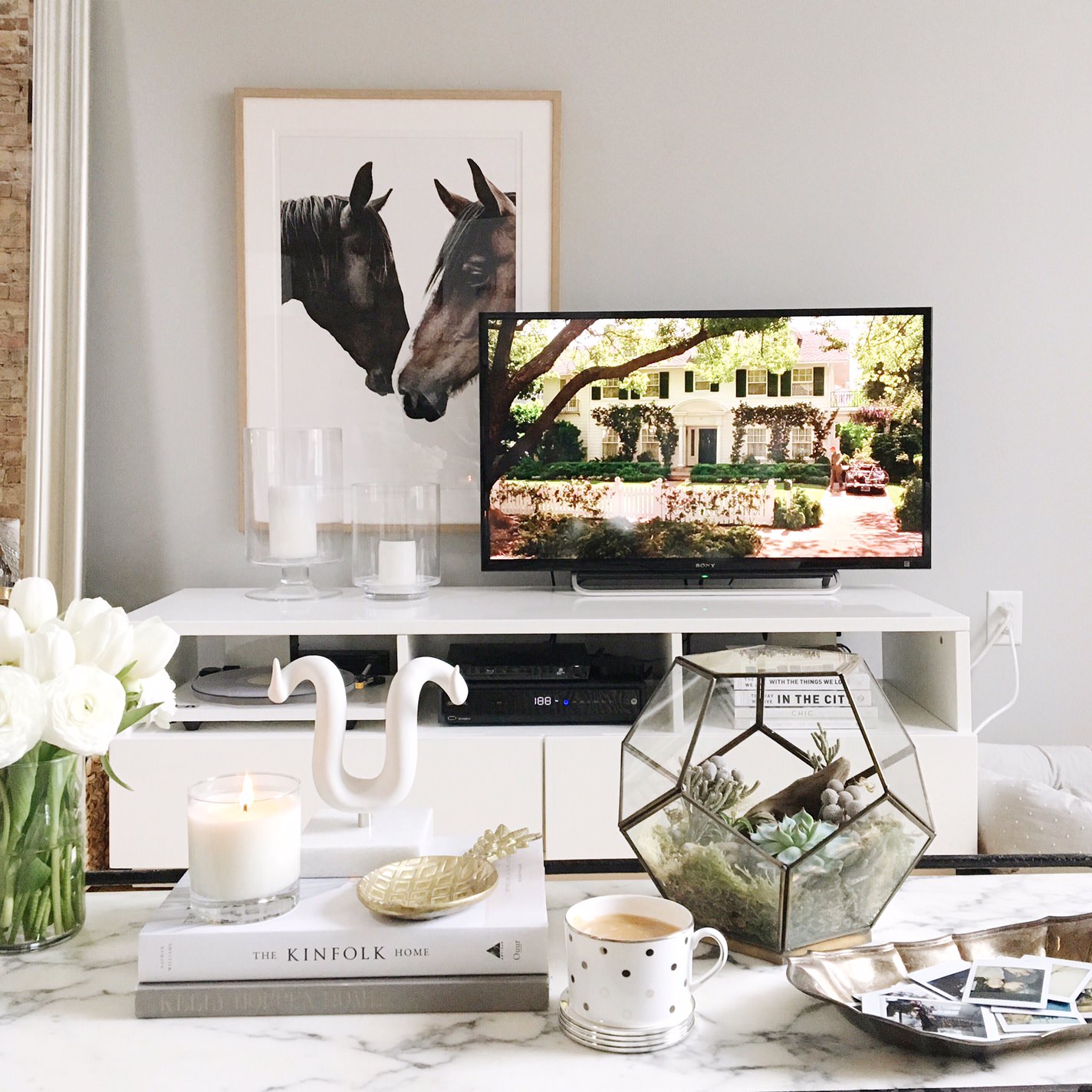
Let’s talk about media console styling
My Kara Rosenlund horses are one of my favorite pieces of art but were above my TV stand 2 home tours ago, and I wanted to do something different. This first photo looked really pretty, but accessing my record player was annoying and I was in the mood to change things up.
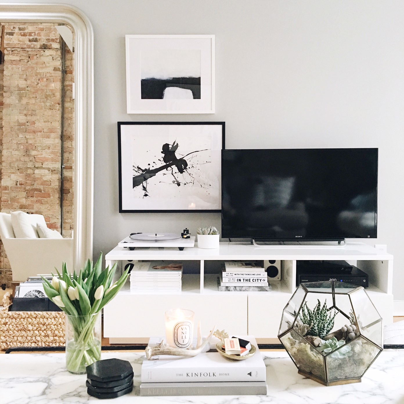
Coffee table styling
My coffee table mostly looked the same from day 1, but I switched out some books and accessories. I recommend stacking 2-3 books, an object or two and a candle on top. When arranging your coffee table, try clustering a few things together. You don’t need to space them out all the way across your coffee table. I know everyone says to group things in 3s but that’s not always the case. You’ll see that I had 2 hurricanes on my TV stand and just 2 books on my coffee table. PS. I prefer the books straight on with the binding facing the coffee table, but that doesn’t mean there’s a right and wrong way to do things.
Styling tip:
Succulents are great because they’ll last for months and in the end, cost less than fresh flowers. You can find a similar terrarium here.
Styling tip:
Don’t hang pieces of art too far apart from one another. I’ve seen this a lot, especially with gallery walls. Had that small piece been up another 6 inches, it might have looked a bit awkward. Look for inspiration in magazines and on pinterest!
Living with a white sofa
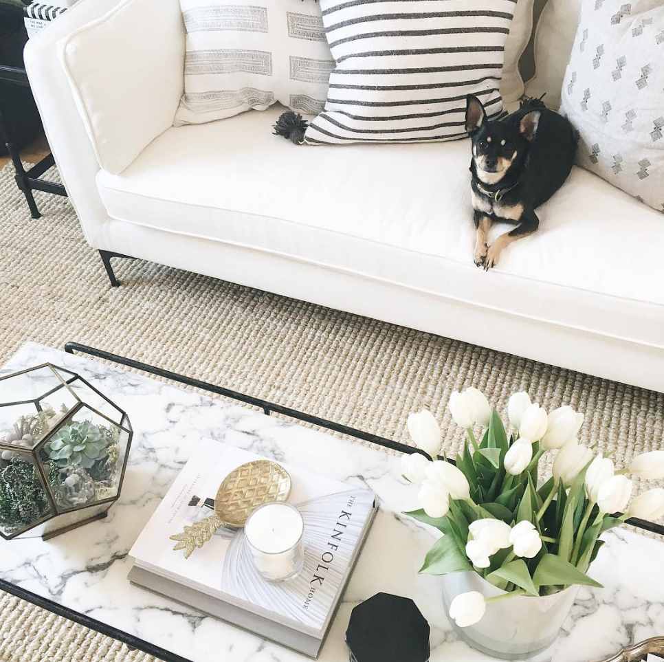
This isn’t my first experience with a white sofa. I had one in my first and second Chicago apartments and loved it. A friend recommended microseal and after hearing that her son got paint on her white sofa, the decision to move forward was an easy one. I’m pretty clean and never had any horrible stains on my last one, so I figured I’d be ok. Then I gave Buddy a piece of BBQ chicken, he dropped it on the floor, I stepped on it, sat on the sofa, dragged my foot with said chicken still attached to it across the sofa, and thought that side of the cushion was over. Dabbed it with a wet cloth and it came out!
Living with a black dog and white sofa
Yes, my dog is black. And yes, he sheds. He’s also tiny (about 11 lbs) so I’d probably feel differently if I had a black dog that weighed 50 lbs. I’ll take a lint/hair remover to the sofa every so often but have learned that I’m going to see his hair on my white sofa and bedding. It’s his house too, after all. The bench cushion cover comes off, so I can always have it dry cleaned if and when I need to.
Styling tip: Buy neutral pieces and add color with pillows and other accents
You’ll notice that throughout the process, it was easy to change things out (thanks to my neutral palette). It also would have been pretty easy to add a touch of color had I wanted to do that. There also aren’t any pieces from the same collection or store. I do have quite a few west elm accessories, but try to bring pieces from different brands and stores to create something that feels a bit more unique to me.
The differences between what my home looks like day-to-day and in my home tour:
I’m a pretty clean person which probably shows on instagram, and don’t put that much into keeping my home organized. I put things away after I use them and fluff my sofa pillows and make my bed every day. I hid my kitchen and bathroom trash cans, bought lots of fresh flowers and plants, had bowls of lemons and apples, and the small piles of papers on my kitchen counter and desk away. And then I just made sure everything was placed in the right spot so it would look great in photos, which might mean changing the angle of a chair to not block a table next to it. Mostly small, subtle shifts though. I did move some art around but nothing was moved back to its original spot post-home tour.
The Office
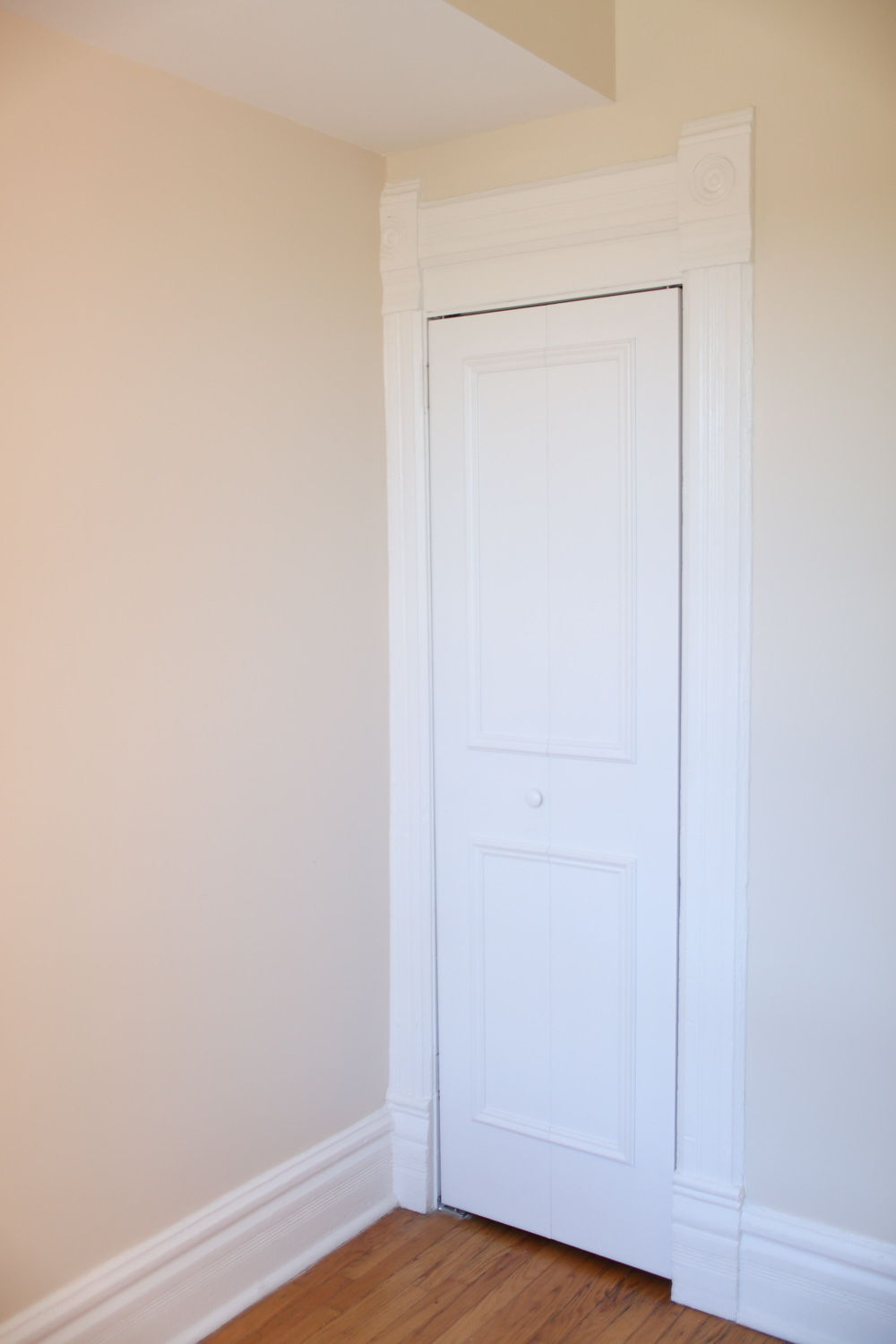
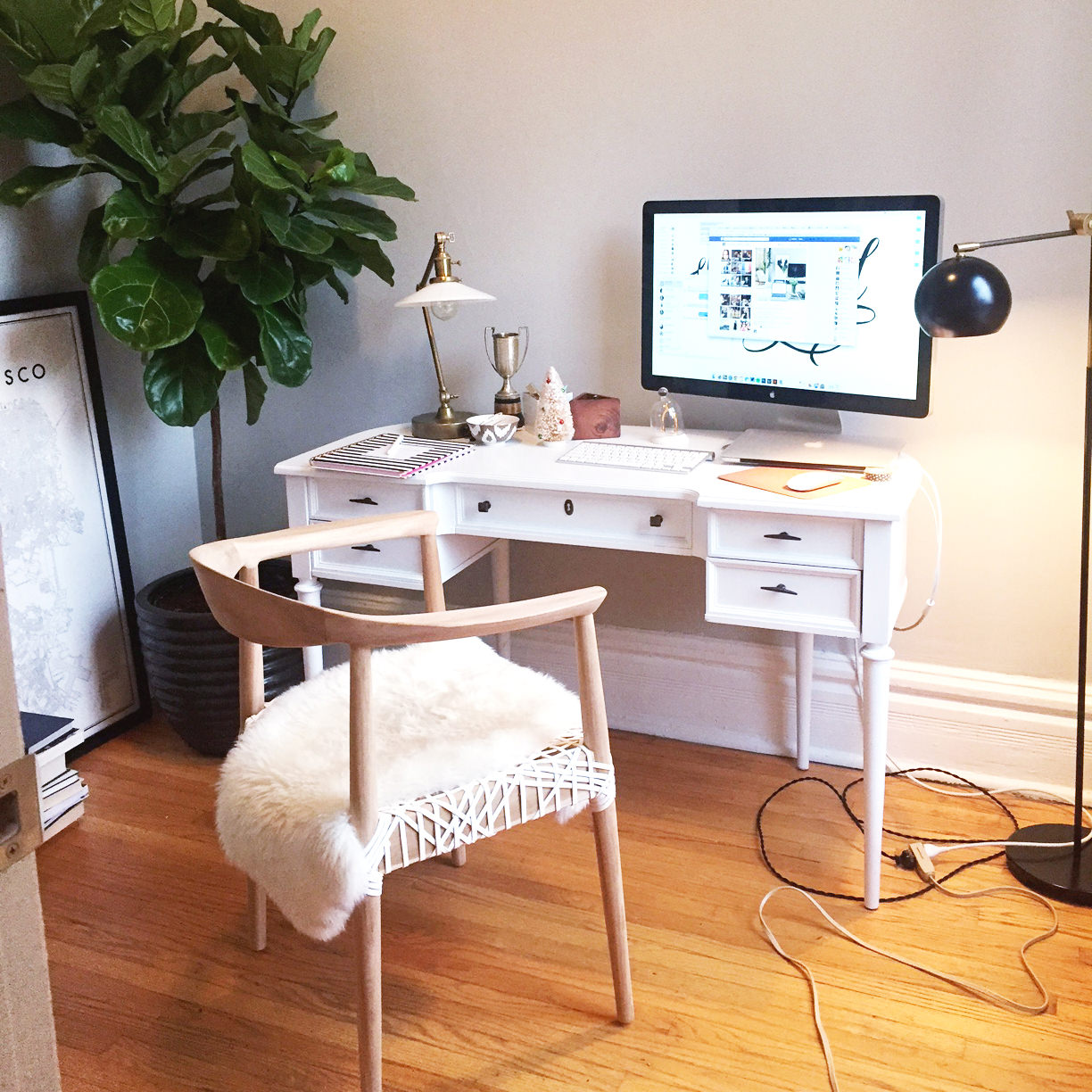
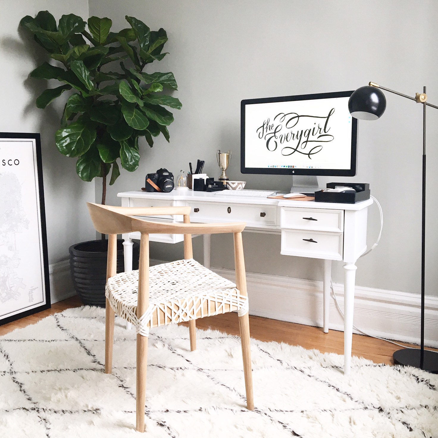
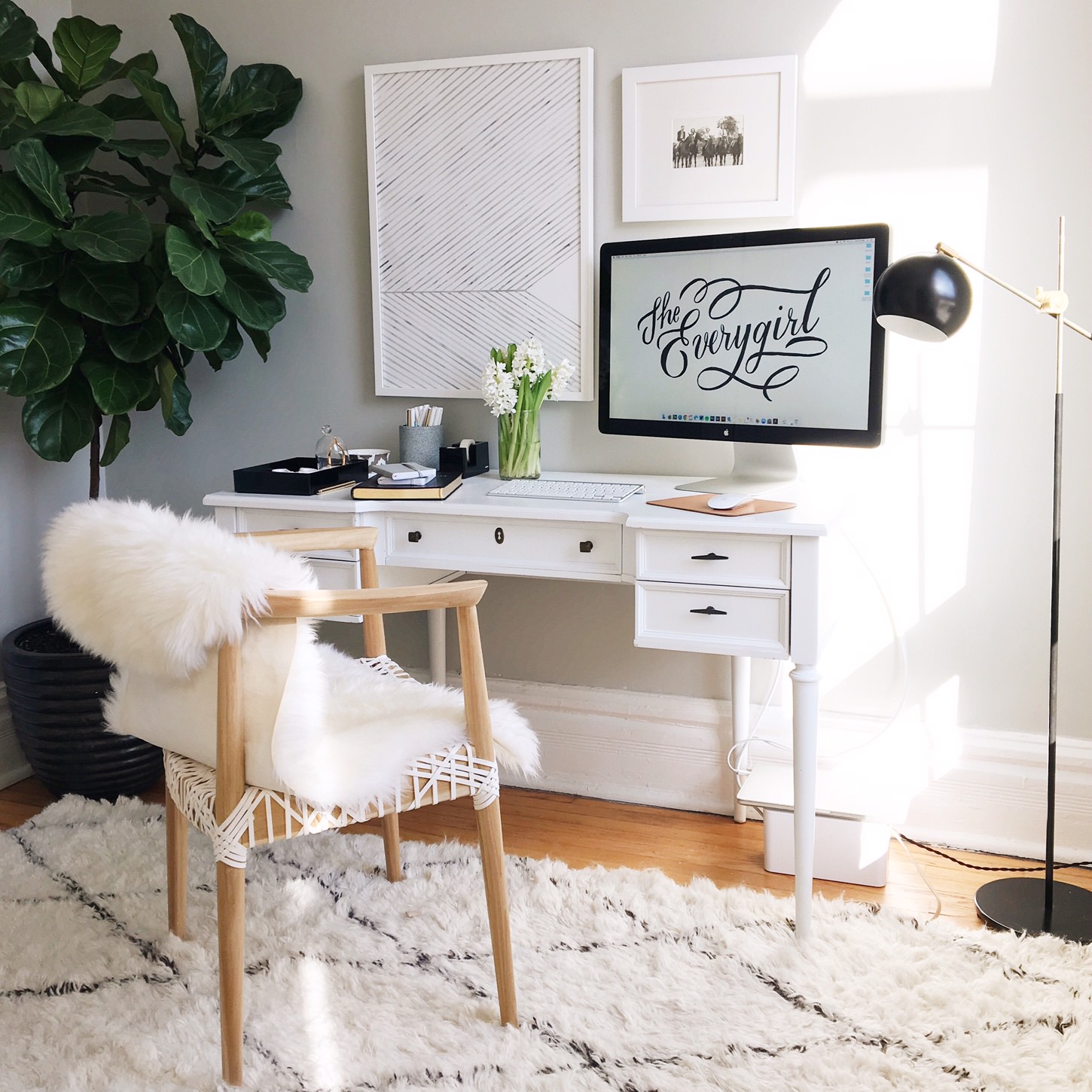
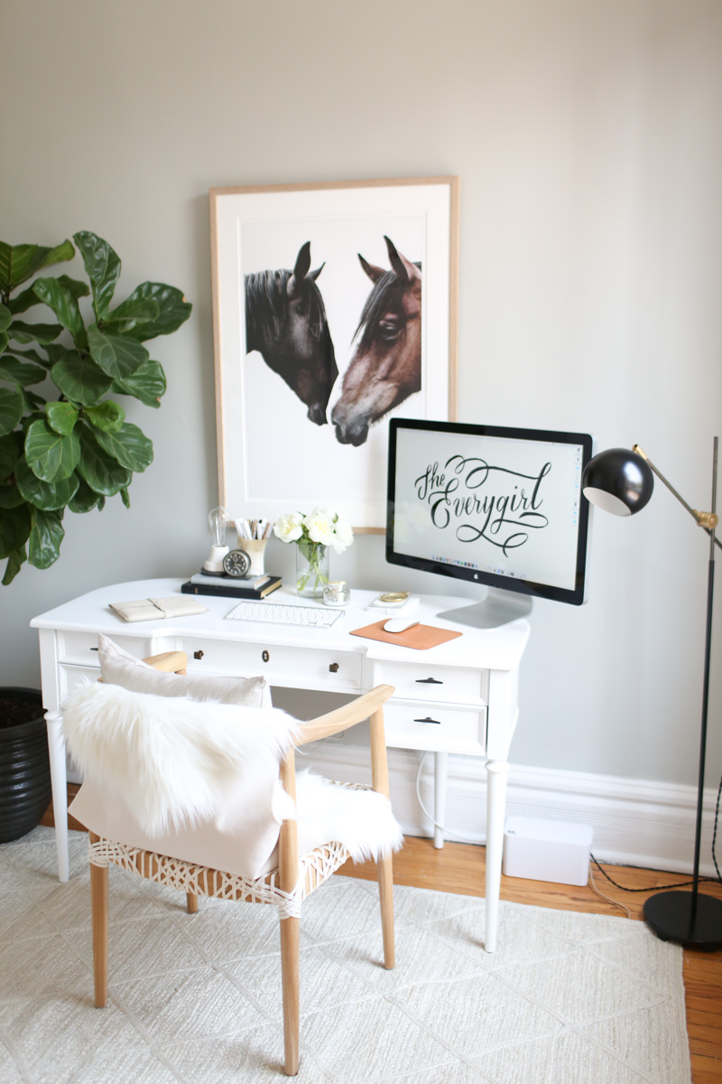
Aside from the living room, this is the room that saw the most change. Here’s the world’s worst “before” photo of the creamy beige walls which were repainted in Benjamin Moore’s Stonington Grey. It started to come together once I got my Meg Made desk in there, but with the only outlet on the opposite wall, a rug was in order along with this nifty little cord-hider. The moroccan rug looked really pretty but shedding drove me crazy, so it was eventually changed out for a jute rug from Serena and Lily.
The Dining Room and Kitchen
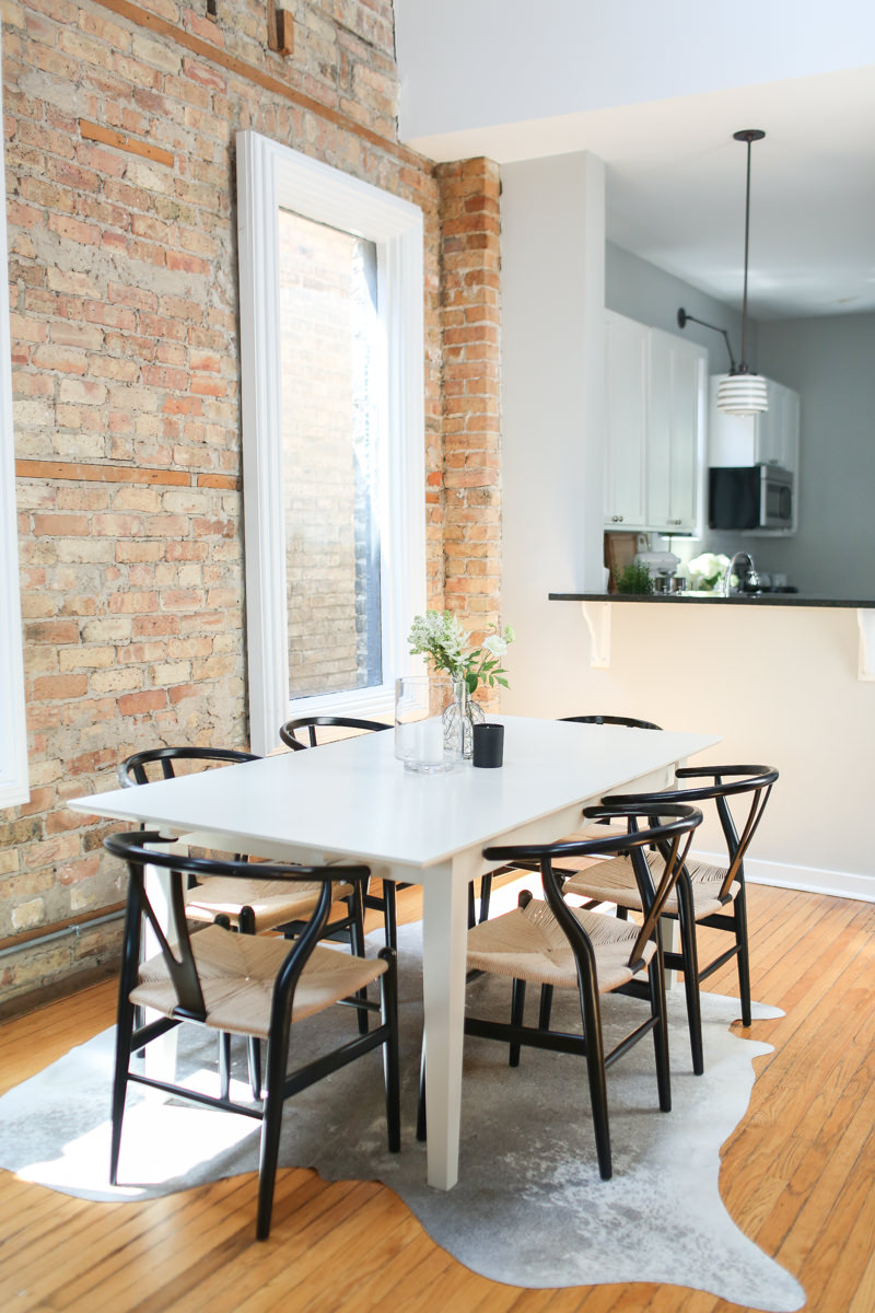
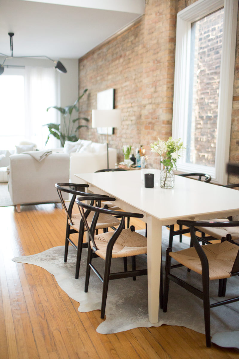
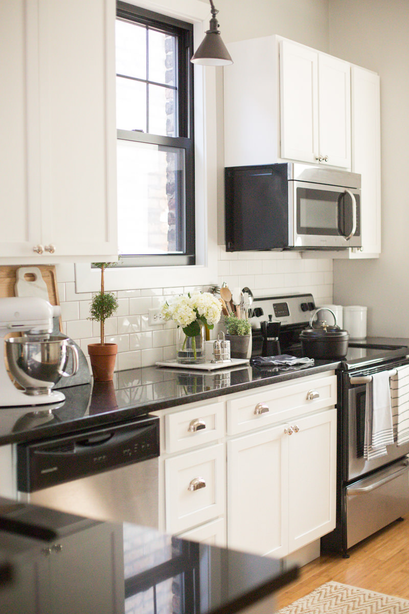
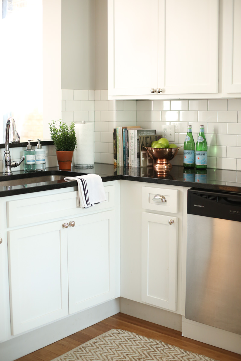
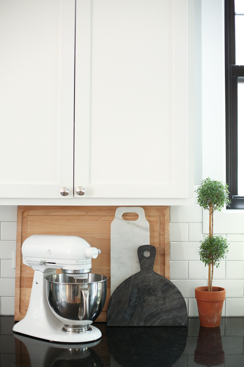
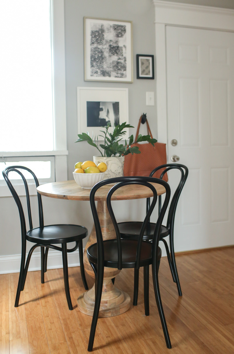
These were the easiest rooms to decorate. I had a pretty set vision of what I wanted it to look like, and it all came down to finding a reasonably priced large white table (great for aerial photography) and black chairs. And I already had a tiny bistro table that fit perfectly in the kitchen. While I didn’t want to invest in pieces I likely couldn’t use later, a small table would have looked ridiculous in this space. The large table has been great for dinners and co-working–was definitely worth it. I’m not big on rules, but I feel like I usually see rugs under dining tables that are way too big or way too small.
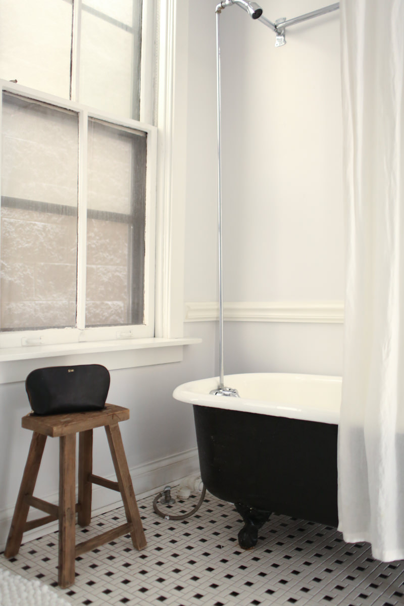
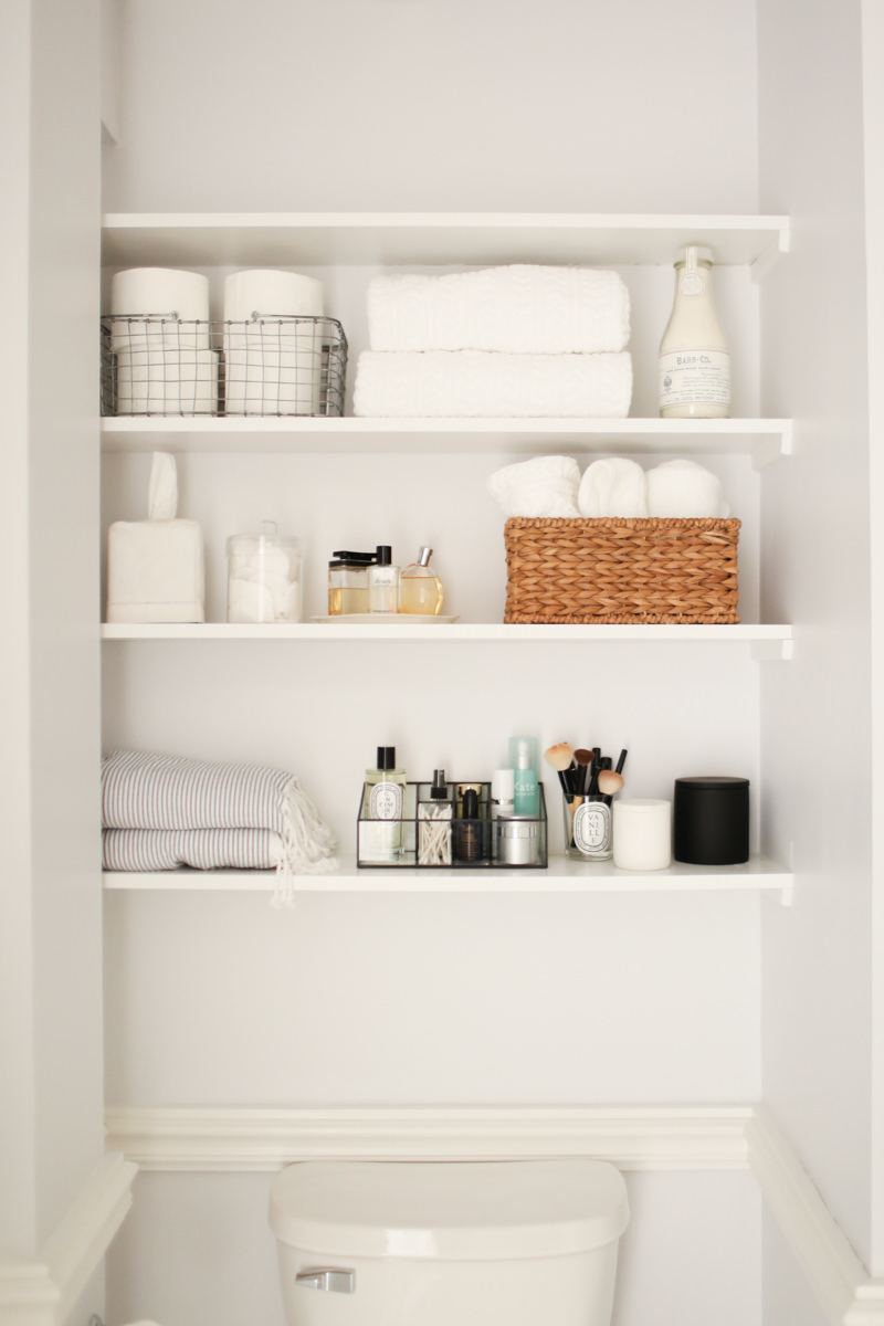
The Bathroom
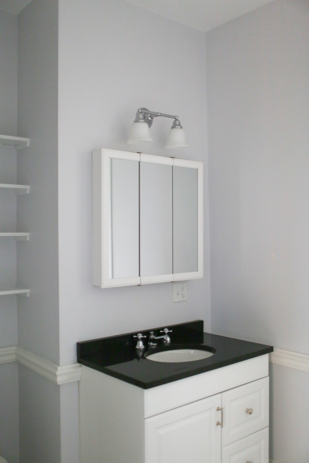
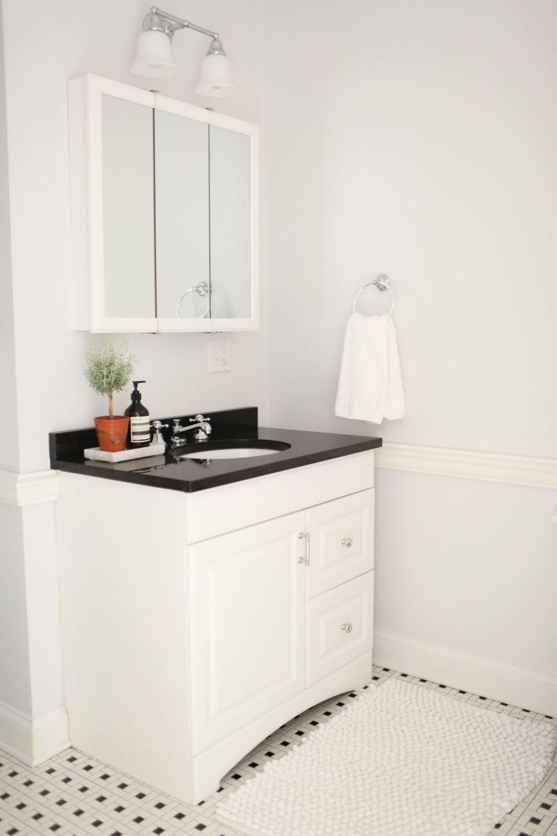
I don’t feel like I have any concrete styling tips for this one (which seems to be the theme of this post) so feel free to leave any questions in the comments section below.
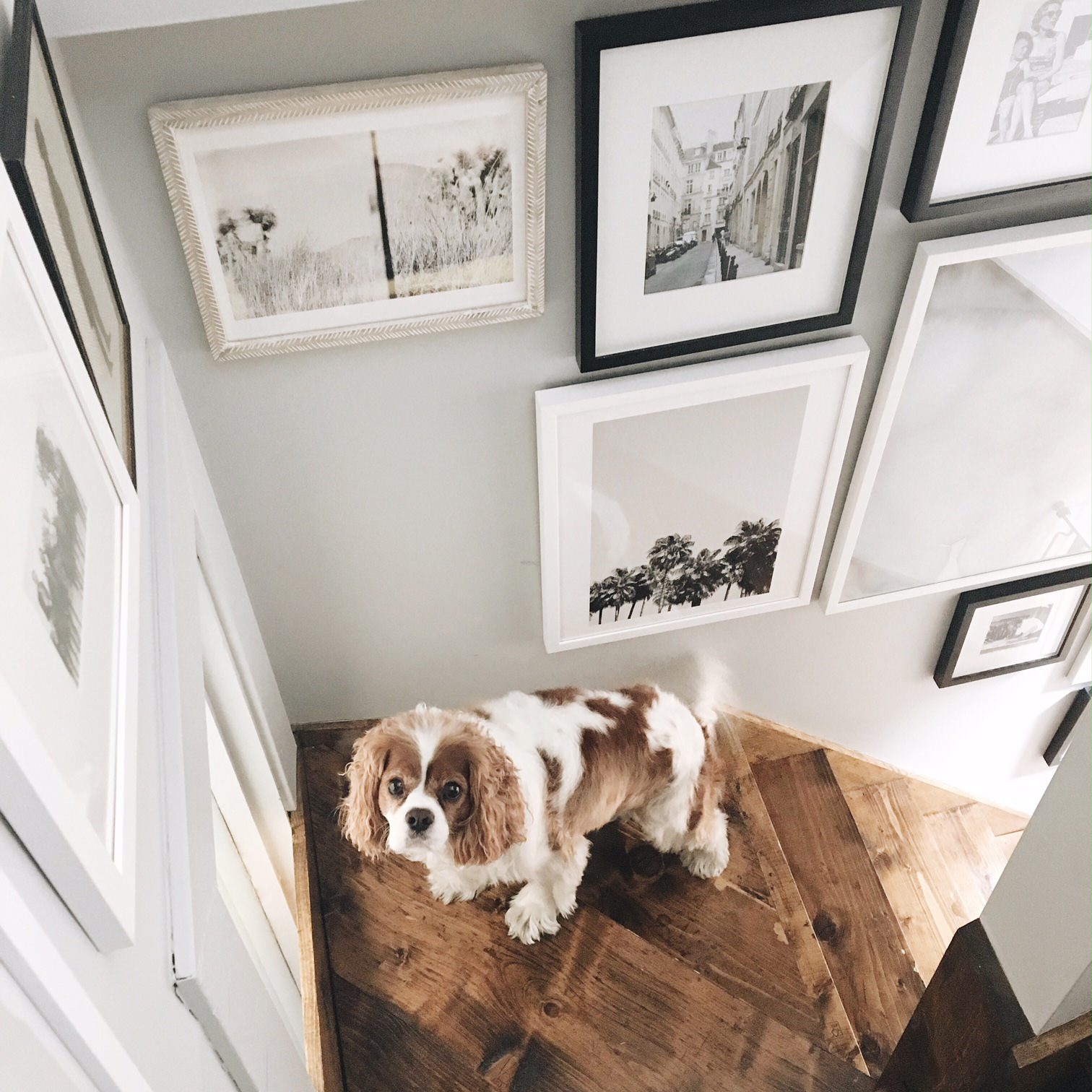
The Stairs
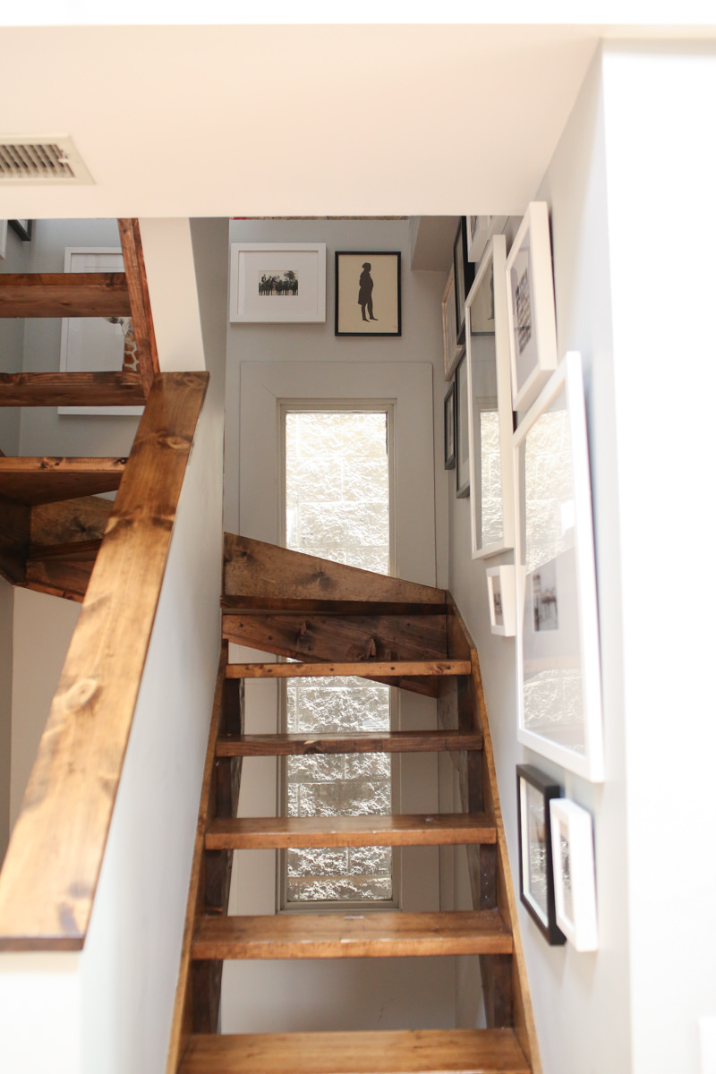
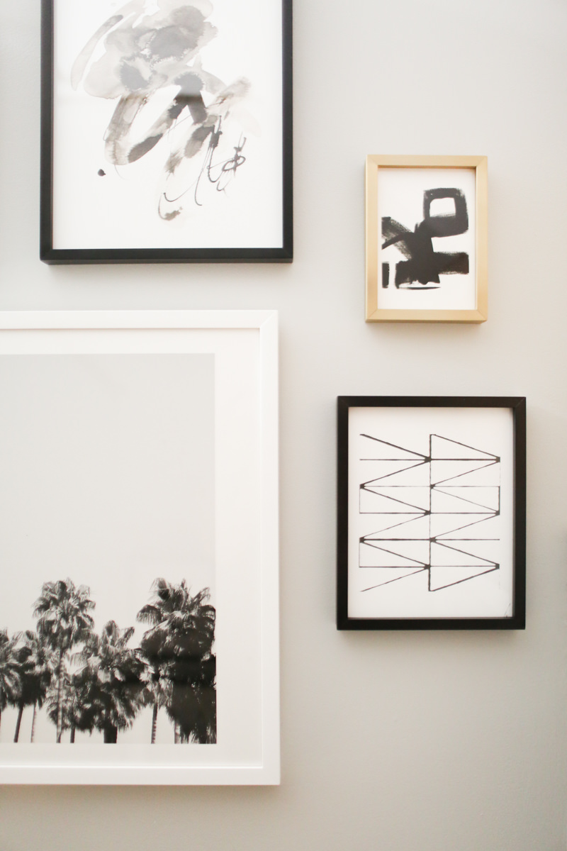
This gallery wall was a last-minute decision, installed a few weeks before shooting (with my friend’s dog by my side). To be very honest with you, had I not had a home tour to shoot or a bunch of great art laying around, I wouldn’t have bothered. But it really upped my stair game, don’t you think? I am decently terrible at hanging gallery walls–I measure nothing and just wing it.
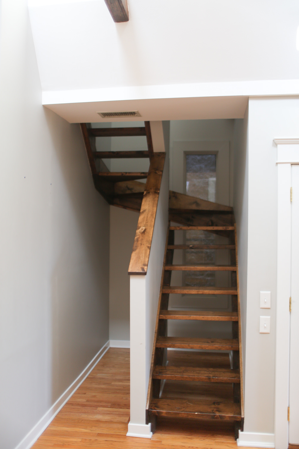
My cozy little hallway
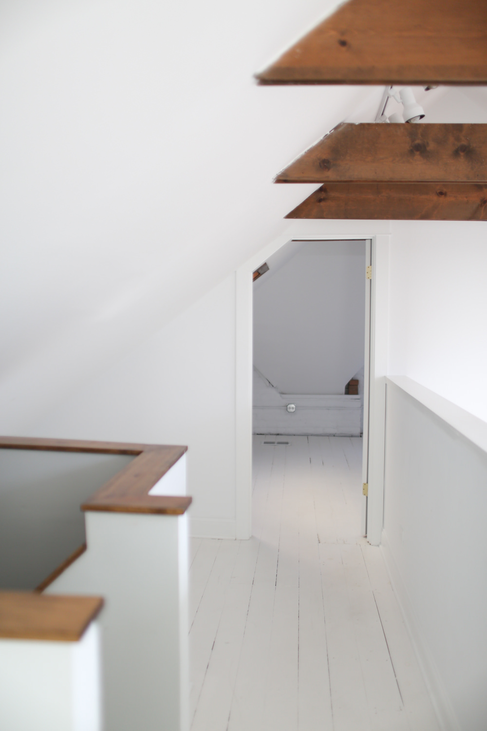
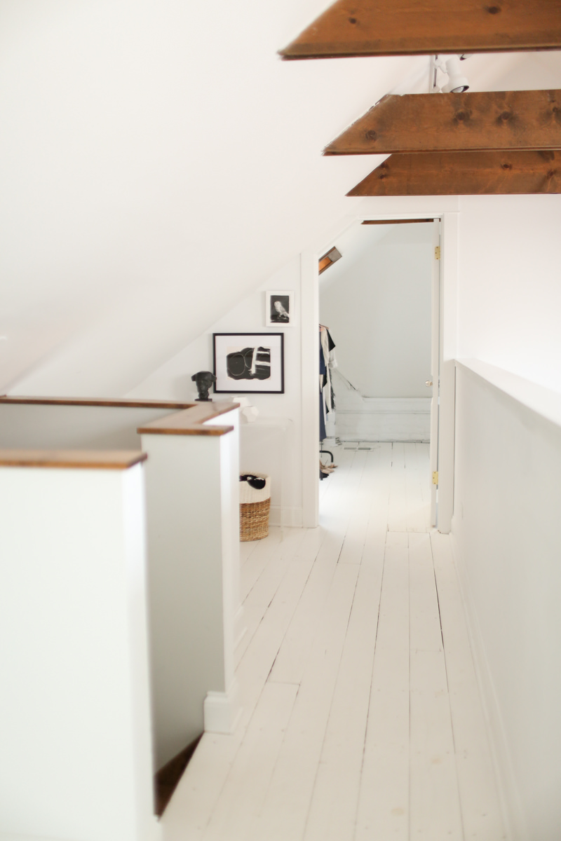
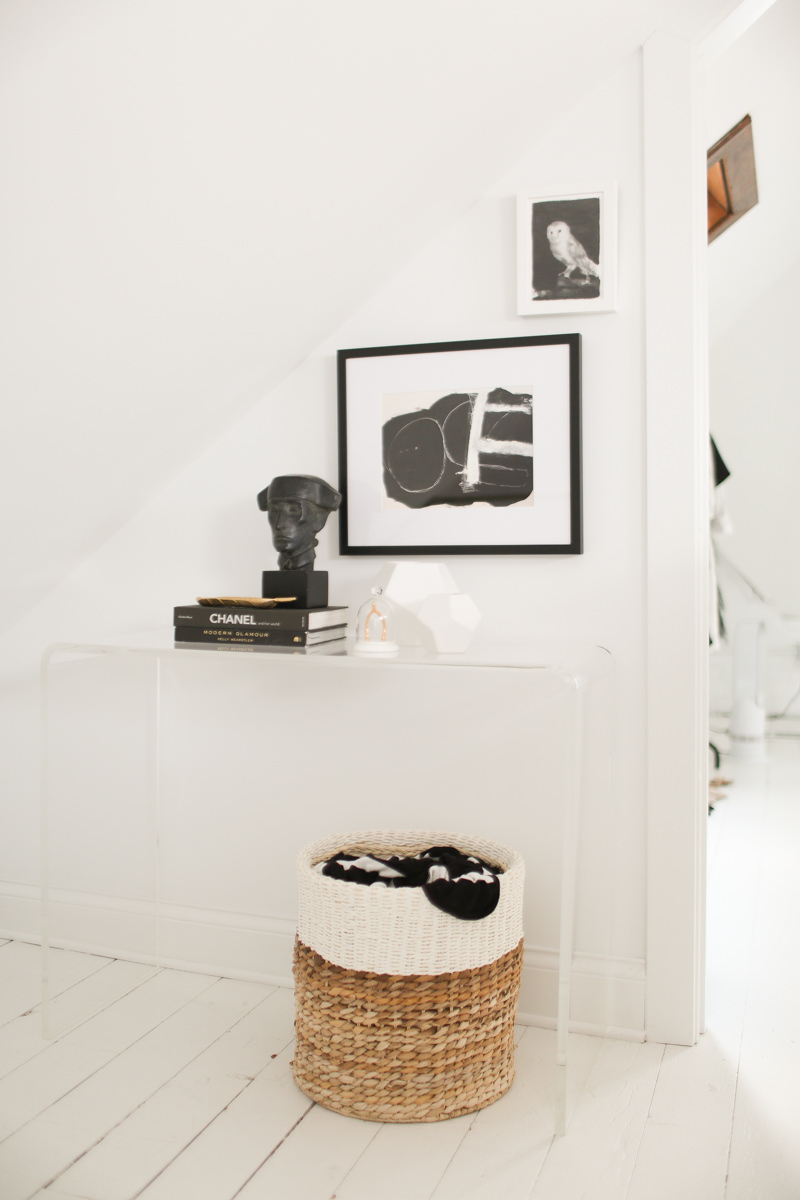
This place is full of crazy little nooks, and I wanted to add a little something to this hall. My lucite console fit perfectly along with this art from Artfully Walls. Baskets are great extra storage for blankets, dog stuff, etc. Even if you’re storing misc. junk in there, throw a blanket on top to keep things looking tidy. PS there are totally random things mixed in there with 2 blankets.
The Bedroom
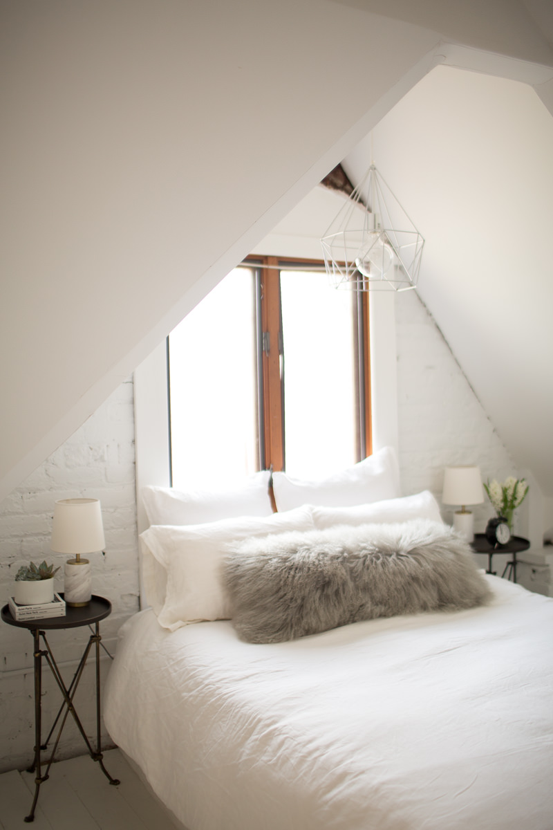
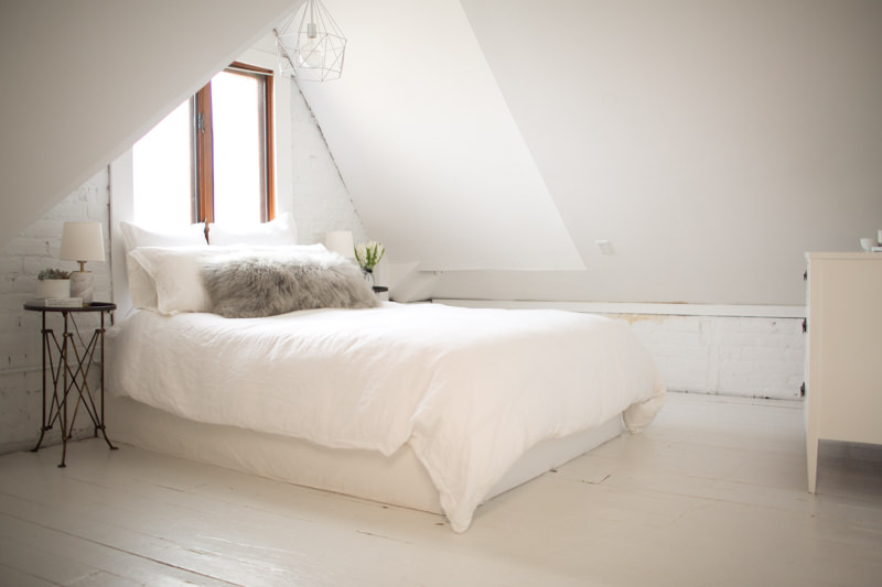
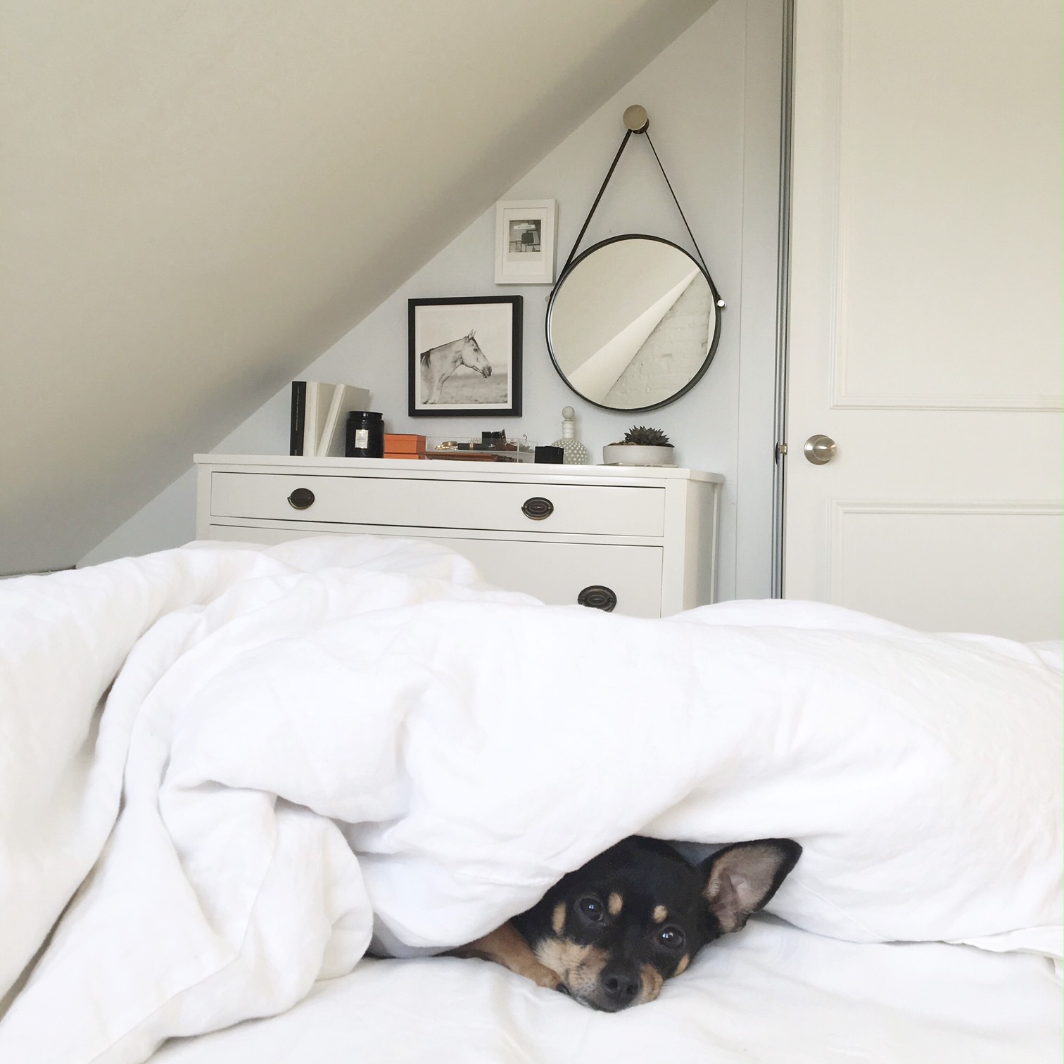
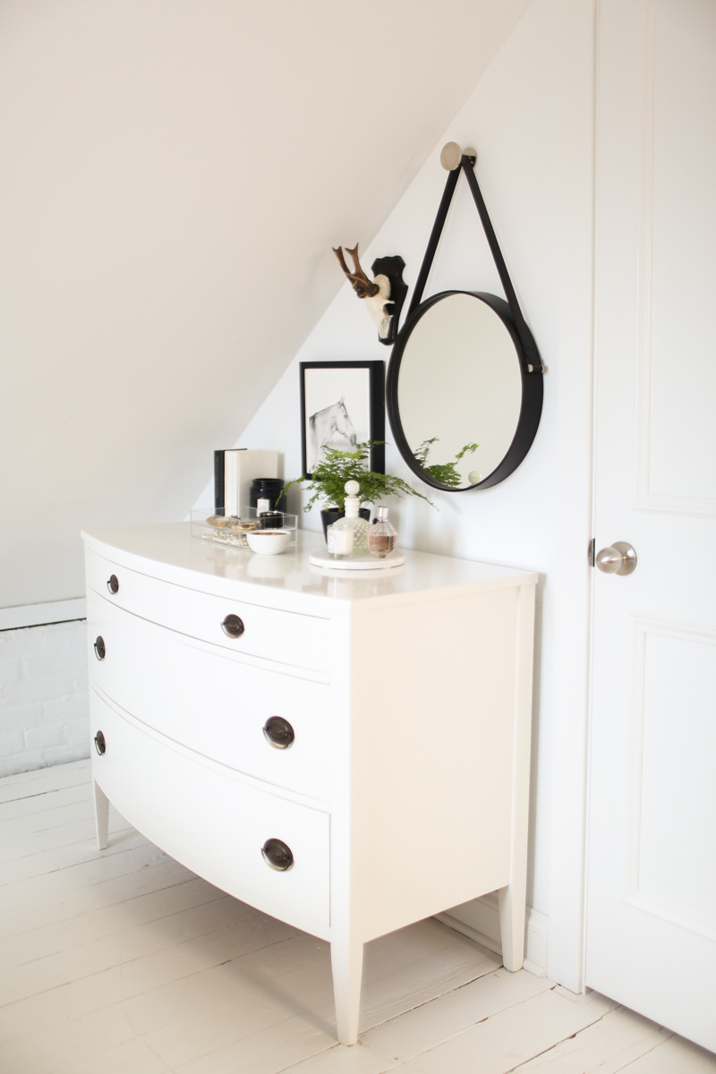
Deciding where to put the bed was easy. The ceilings are pretty low and the slants are worth the 5x a day I smashed my head into the wall my first few weeks living here. I’m down to maybe 1-2x a week now. Anyway, I had to lose my bed frame and didn’t want to invest in a platform bed (but did almost buy this one), so I bought a linen box spring cover. Nightstands are always stupidly expensive and not something I wanted to spend money on, so I found these for $80, and am very, very happy with them. The awkward nook directly across from my bed was filled with my dresser, which I had refinished by my friend Meg of Meg Made, and some art.
The Guest Room / Studio
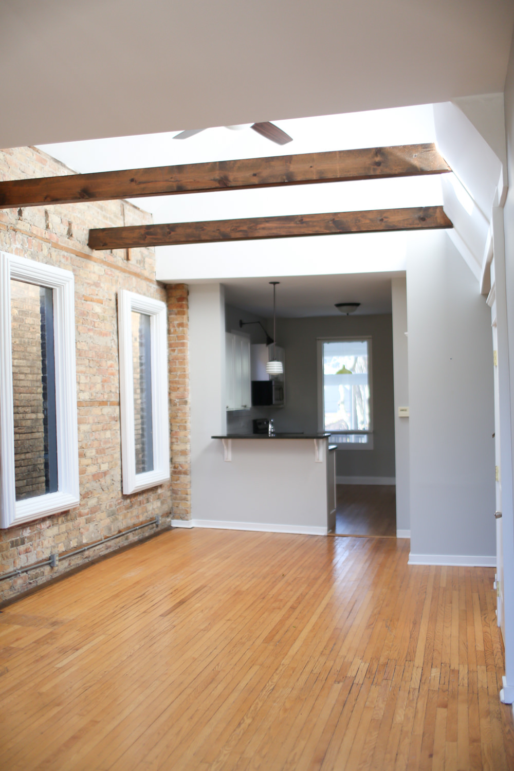
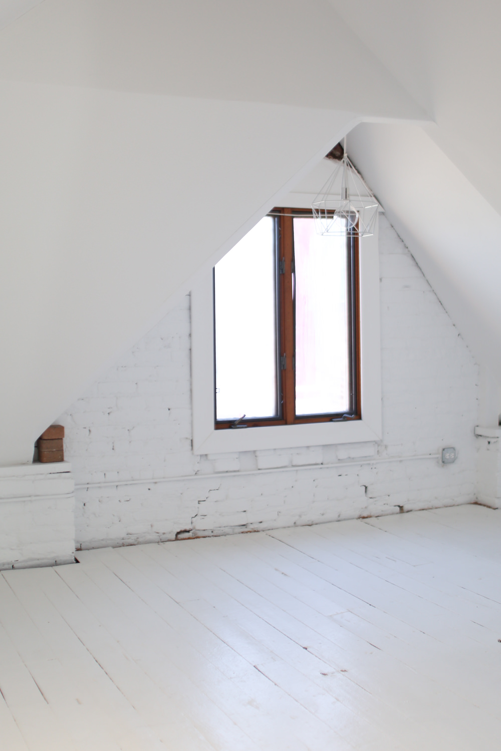
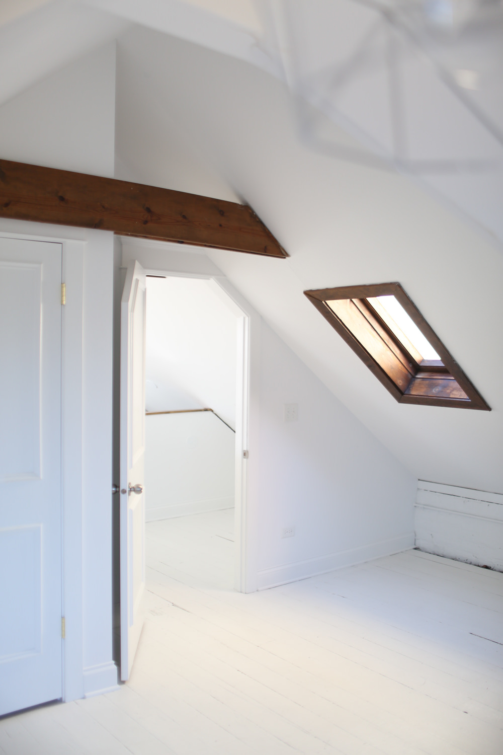
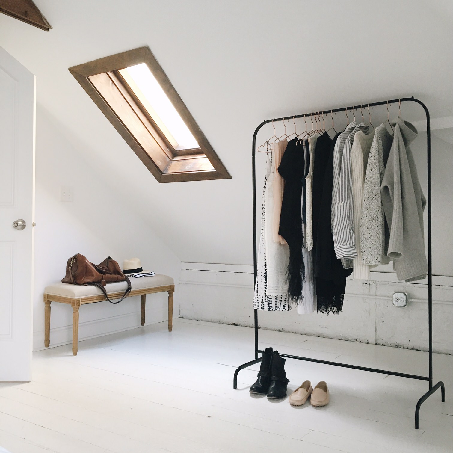
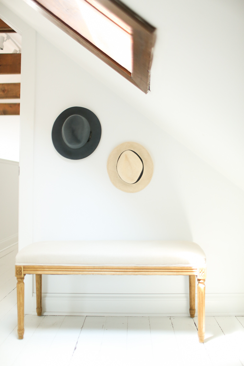
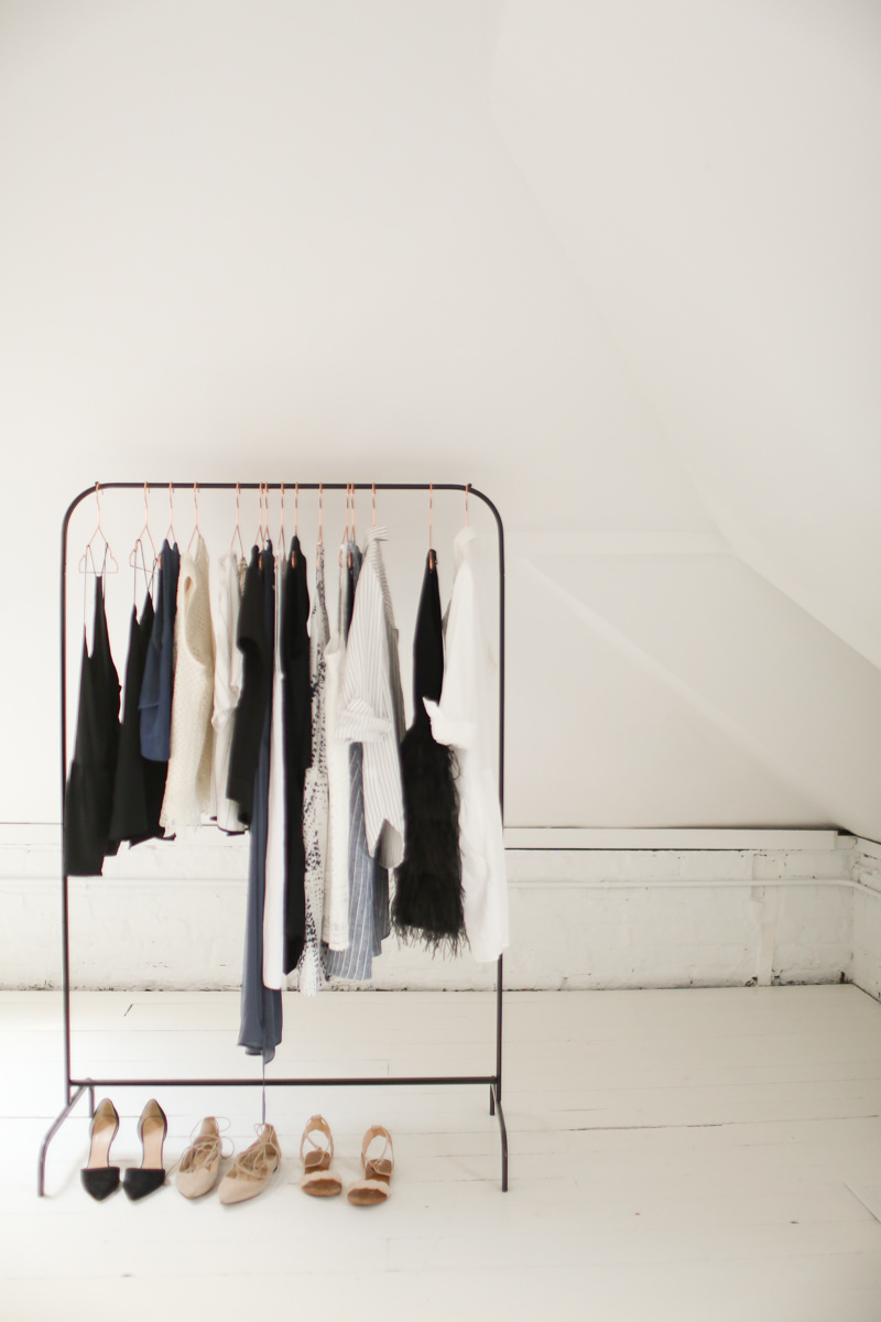
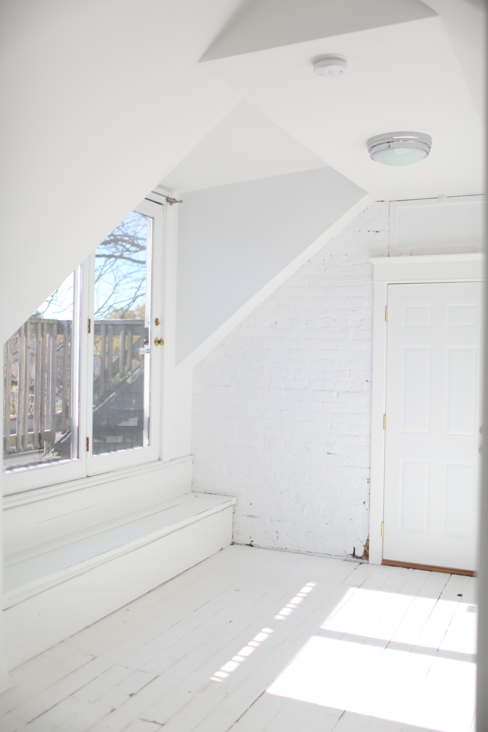
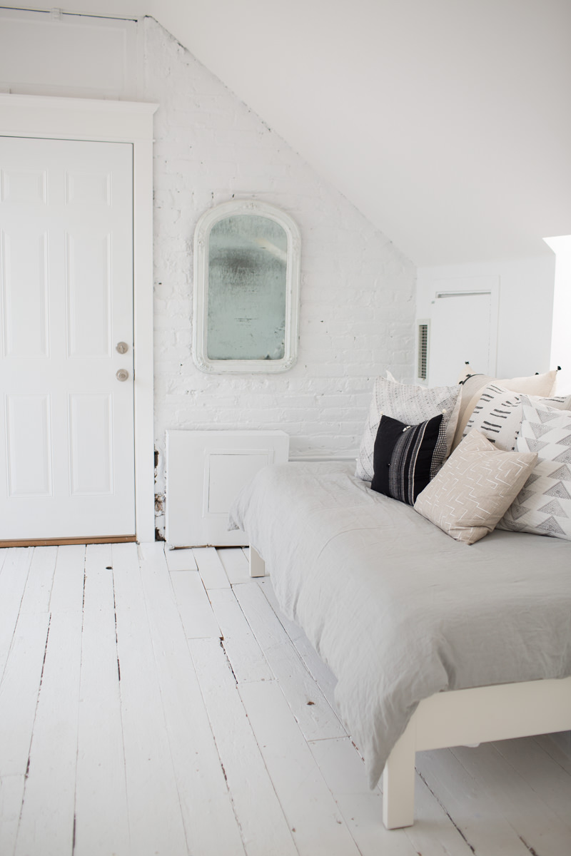
This room was a huge selling point for me since it’s a big, empty, white room with painted wood floors and brick walls. Perfect for shooting, but since I don’t do that every day, I wanted to give it another purpose. Enter my twin bed frame and Casper mattress. A daybed for relaxing (ok, so I never do this but do fold laundry there) and for houseguests. I’ve actually had a few friends and even Everygirl team members stay in this room. And I have 2 more friends coming to town through September. While I don’t have plans to keep the bed, it’s definitely served its purpose.
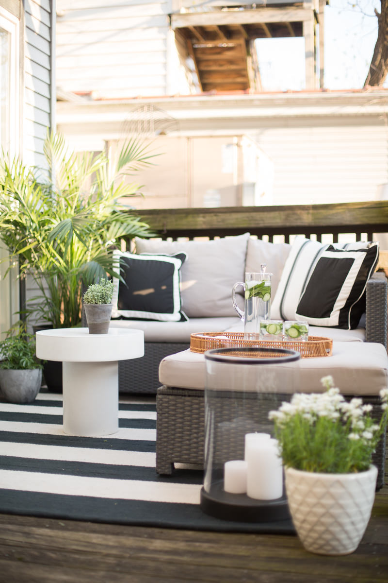
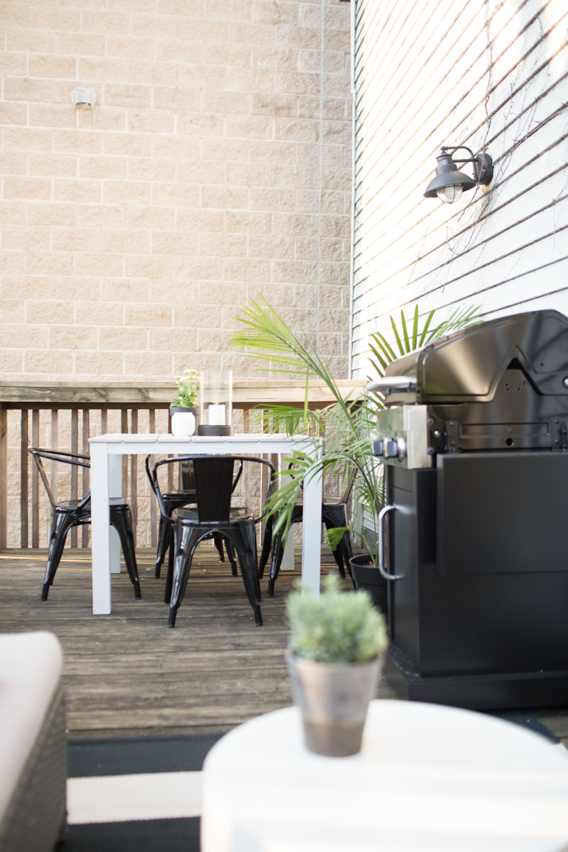
And The Deck
I seem to have lost all the before photos of my deck, but you get the idea. It’s not in the best shape and the surrounding area isn’t very pretty, but I gave it my best and am really happy with how it turned out.
This blog post contains affiliate links. If you purchase something using my links, I may earn a small commission at no cost to you.

